pacman::p_load(tidyverse, scales, patchwork, ggtext, DT)Take Home Exercise 1 - Part 2
Overview
For this take-home exercise, I will select one data visualization from the submissions of our classmates for Take-Home Exercise 1. My task is to critique the selected visualization with respect to clarity and aesthetics. Following the critique, I will prepare a sketch for an alternative design, utilizing the principles and best practices of data visualization as covered in Lessons 1 and 2. Finally, I will recreate the original design using tools from ggplot2, its extensions, and other packages in the tidyverse suite.
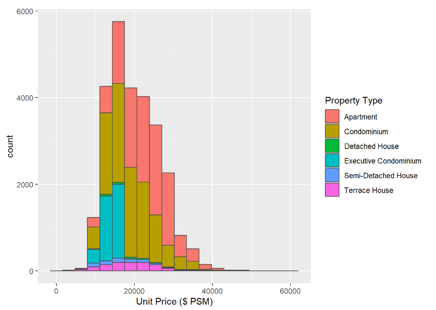
The graph that has chosen is from here. It is a geom_history made by our fellow classmate.
First Glance
Positive Points
The graph effectively clarifies the comparison across various property types, making it easy for the audience to grasp differences at a glance.
The colour scheme is okay and overall it is a graph with straightforward interpretation without overwhelming the viewer.
Improvements
To further explore the relationship between total price and unit price per square foot across different property types, consider employing a more detailed graph, such as a violin plot. This could provide a deeper understanding of data distribution and variance within each category.
Enhancing the bar chart with data labels could significantly improve its readability. By directly displaying key information on the graph, viewers can quickly comprehend the data without needing to cross-reference with the axis. This step will streamline the presentation and make the information more accessible at a glance.
Data Preparation
tidyverse: A collection of R packages that work in harmony to handle data manipulation, exploration, and visualization. Key components include
ggplot2for data visualization,dplyrfor data manipulation,tidyrfor tidying data, andreadrfor reading data, among others. It’s essential for modern data science in R.scales: This package provides functions for mapping data to visual properties (like color, size, or shape) and formatting axes. It helps customize the scales of visual mappings in
ggplot2charts, making your visualizations more readable and precise.patchwork: An add-on to
ggplot2, designed to make it simple to combine separate ggplots into a single plot layout. It provides a user-friendly syntax for arranging and annotating multiple graphs as one cohesive visualization.ggtext: Enhances
ggplot2by allowing richer text formatting in visualizations. Withggtext, you can use HTML and CSS to style the text elements in your plots, such as titles, labels, and annotations, giving you greater control over the text aesthetics.DT: Provides an interface to the JavaScript library DataTables. It allows R users to create interactive tables in R Markdown documents or Shiny web applications. These tables can be sorted, filtered, paginated, and even styled without needing to write extensive JavaScript code.
Load Packages
Click to show code
Click to show code
ds1 <- read_csv("data/ds1.csv")
ds2 <- read_csv("data/ds2.csv")
ds3 <- read_csv("data/ds3.csv")
ds4 <- read_csv("data/ds4.csv")
ds5 <- read_csv("data/ds5.csv")
Converting Data
Click to show code
prepare_dataset <- function(ds) {
  colSums(is.na(ds))
  ds <- na.omit(ds)

  ds$`Type of Sale` <- tolower(as.character(ds$`Type of Sale`))
  ds$`Type of Sale` <- ifelse(ds$`Type of Sale` %in% c("new sale", "resale"), ds$`Type of Sale`, "other")
  ds$`Type of Sale` <- as.factor(ds$`Type of Sale`)

  ds$`Property Type` <- as.factor(ds$`Property Type`)

  ds$`Transacted Price ($)` <- as.numeric(gsub("[^0-9.]", "", ds$`Transacted Price ($)`, perl = TRUE))
  ds$`Area (SQFT)` <- as.numeric(gsub("[^0-9.]", "", ds$`Area (SQFT)`, perl = TRUE))
  ds$`Unit Price ($ PSF)` <- as.numeric(gsub("[^0-9.]", "", ds$`Unit Price ($ PSF)`, perl = TRUE))

  return(ds)
}

# Apply the function to each dataset
ds1 <- prepare_dataset(ds1)
ds2 <- prepare_dataset(ds2)
ds3 <- prepare_dataset(ds3)
ds4 <- prepare_dataset(ds4)
ds5 <- prepare_dataset(ds5)

# Combine the datasets
combined_ds <- rbind(ds1, ds2, ds3, ds4, ds5)
Converting Dates
Click to show code
# Convert Sale Date to Date format
ds1$`Sale Date` <- dmy(ds1$`Sale Date`)
ds2$`Sale Date` <- dmy(ds2$`Sale Date`)
ds3$`Sale Date` <- dmy(ds3$`Sale Date`)
ds4$`Sale Date` <- dmy(ds4$`Sale Date`)
ds5$`Sale Date` <- dmy(ds5$`Sale Date`)
:::
Orginal Graph
library(ggplot2)

# Assuming `private_property_data` is your combined dataset
ggplot(data = combined_ds, aes(x = `Unit Price ($ PSF)`, fill = `Property Type`)) +
  geom_histogram(bins = 20, color = "grey30")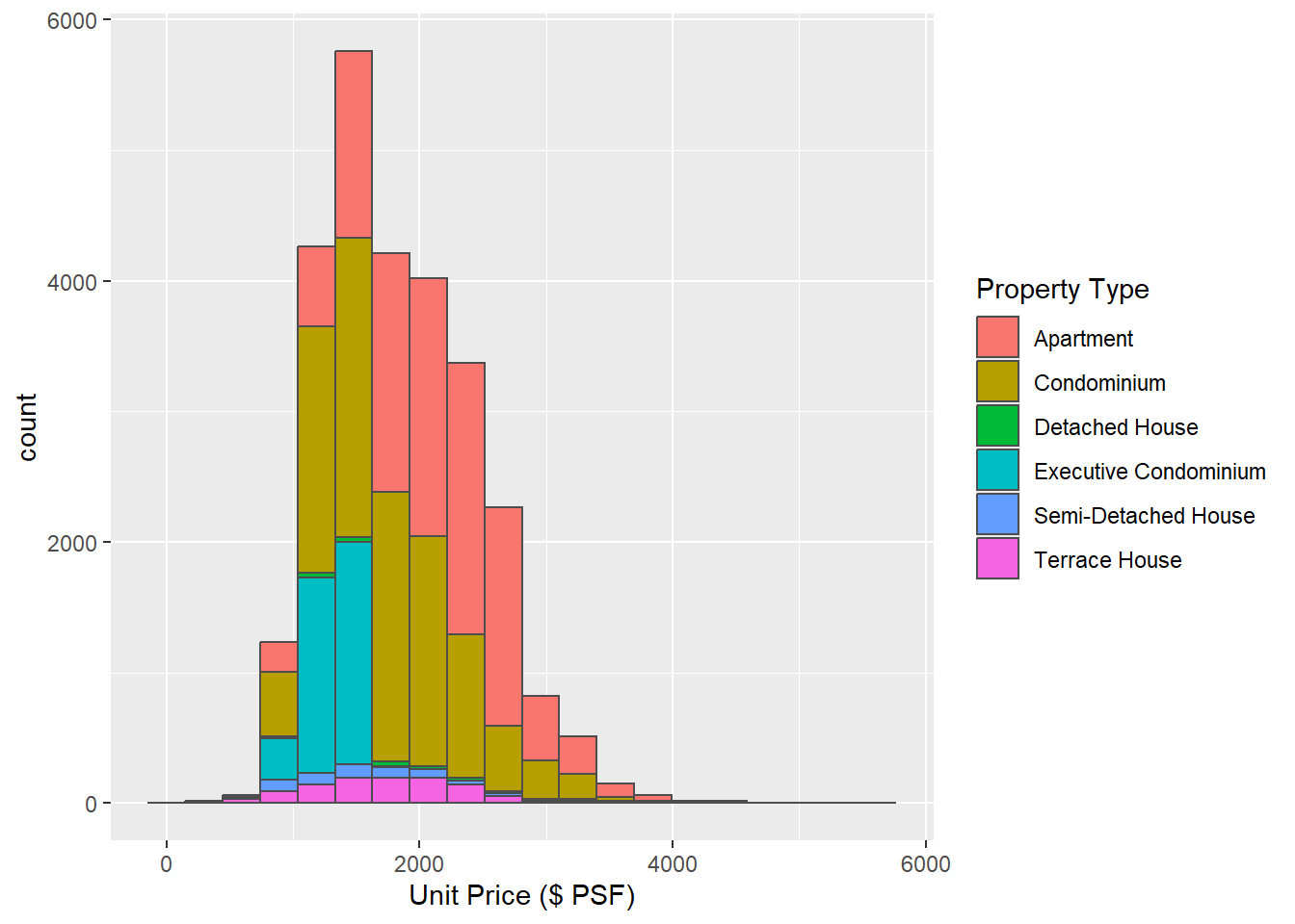
Violin Chart
In this scenario, a violin plot can be a good choice for visualizing the distribution and density of ‘Unit Price ($ per square foot)’ across different ‘Property Types’.
The violin plot combines the both box plots and density plots, offering a deeper understanding of the data’s distribution. By visually representing the data’s density estimates, it reveals peaks, valleys, and the spread of the data, which are crucial for identifying patterns and outliers.
This could provide insightful details such as whether certain property types are more variable in price or if they tend to have a particular pricing structure.
My Sketch
What I have in mind:
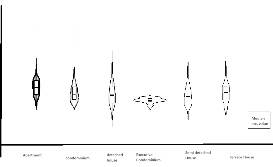
Changes Implemented
Transitioned to a Violin Chart: Instead of using a stacked bar chart, I have switched to a violin chart to better visualize the unit price per square meter across different property types. This change offers a clearer representation of the data distribution and variance.
Inclusion of IQR (Interquartile Range): The violin chart now includes the Interquartile Range (IQR) to provide a more detailed statistical summary. Additionally, users can hover over specific areas of the chart to view the exact values, enhancing interactive data exploration.
Modified Representation of Property Types: Rather than distinguishing property types by colour within a single chart, each property type is now represented by its own individual violin chart. This alteration avoids colour overlap and simplifies the differentiation between types, making it easier for the audience to interpret the data visually.
Click to show code
library(ggplot2)
library(plotly)

ggplot_object <- ggplot(data = combined_ds, aes(x = `Property Type`, y = `Unit Price ($ PSF)`, fill = `Property Type`)) +
  geom_violin(trim = FALSE) +
  geom_boxplot(width = 0.1, fill = "white", outlier.shape = NA, alpha = 0.5) +  # Overlay boxplot
  stat_summary(fun = median, geom = "point", color = "red", size = 3) +  # Add a red dot for the median
  labs(title = "Distribution of Unit Price by Property Type with IQR",
       x = "Property Type",
       y = "Unit Price ($ PSF)") +
  theme_minimal() +
  theme(legend.title = element_text(size = 8),
        legend.text = element_text(size = 8),
        axis.text.x = element_text(size = 8))


plotly_object <- ggplotly(ggplot_object, tooltip = c("y", "x"))plotly_objectFirst Iteration
Click to show code
library(ggplot2)
library(plotly)
library(RColorBrewer)  # For color palettes
library(scales)        # For label wrapping

# Assuming `combined_ds` is your combined dataset
ggplot_object <- ggplot(data = combined_ds, aes(x = `Property Type`, y = `Unit Price ($ PSF)`, fill = `Property Type`)) +
  geom_violin(trim = FALSE, adjust = 1, alpha = 0.4) +
  geom_boxplot(width = 0.1, fill = "ivory", outlier.shape = NA, alpha = 0.75) +  # Overlay boxplot
  stat_summary(fun = median, geom = "point", color = "darkred", size = 1) +  # Add a red dot for the median
  scale_fill_brewer(palette = "Paired") +  # Improved color palette
  labs(title = "Distribution of Unit Price by Property Type with IQR",
       subtitle = "Visualizing spread and central tendency",
       x = "Property Type",
       y = "Unit Price ($ PSF)") +
  theme_minimal(base_size = 10) +  # Base font size
  theme(
    legend.position = c(0.85, 0.85),  # Adjust legend position inside the plot
    legend.justification = c("right", "top"),
    legend.box.just = "right",
    legend.title = element_text(size = 10),
    legend.text = element_text(size = 8),
    axis.title = element_text(size = 8),
    plot.title = element_text(size = 10, face = "bold"),
    plot.subtitle = element_text(size = 10),
    axis.text.x = element_text(size = 8, angle = 0, hjust = 1, vjust = 1),  # Adjusted for better alignment
    plot.background = element_rect(fill = "ivory"),
    panel.grid.major = element_line(color = "gray80"),
    axis.line = element_line(color = "black")  # Adding axis lines
  ) +
  scale_x_discrete(labels = label_wrap_gen(width = 10))  # Wrap labels for Property Type

# Convert to plotly object with enhanced tooltips
plotly_object <- ggplotly(ggplot_object, tooltip = c("y", "x", "fill"))print(plotly_object)Thoughts and Improvements
Remove Redundant Legends: The property types are effectively differentiated by colour within the plot itself, making the legends redundant. Removing the legends will de-clutter the visual space, allowing the plot to be extended horizontally. This extension will better utilize the available space, improving the overall layout and readability.
Enhance X-axis Label Readability: Given the importance of property type identification in our analysis, the text labels on the X-axis will be enlarged and bold. This adjustment ensures that these key identifiers are immediately legible, facilitating quicker and clearer comprehension by viewers.
Adjust Y-axis Scale and Tick Marks: To accurately represent all data points, including outliers, the Y-axis will be extended to a maximum of at least 6,500. Additionally, tick marks will be placed every 500 units. These changes will ensure that even outlier values are visible and that the scale of the plot is practical for detailed analysis.
Second Iteration
Click to show code
library(ggplot2)
library(RColorBrewer)  # For color palettes

# Assuming `combined_ds` is your combined dataset
overall_median <- median(combined_ds$`Unit Price ($ PSF)`, na.rm = TRUE)  # Calculate the overall median

ggplot_object <- ggplot(data = combined_ds, aes(x = `Property Type`, y = `Unit Price ($ PSF)`, fill = `Property Type`)) +
  geom_violin(trim = FALSE, adjust = 1, alpha = 0.4) +
  geom_boxplot(width = 0.3, fill = "darkgrey", outlier.shape = 10, outlier.color = "black", outlier.size = 2, alpha = 0.75) +
  stat_summary(fun = median, geom = "text", aes(label = round(..y.., 2)),
               color = "darkred", size = 3, vjust = 0, hjust = -0.5, fontface = "bold") +
  geom_hline(yintercept = overall_median, color = "yellow", size = 0.65, linetype = "dotted") +
  annotate("text", label = paste("Median: $", round(overall_median, 2)),
           x = Inf, y = Inf, hjust = 1.05, vjust = -0.05,  # Fine-tuned adjustment to top right
           color = "black", size = 4, fontface = "bold",
           bg = "darkred", box.colour = "black") +  # Adjusted font size and position
  scale_fill_brewer(palette = "Paired", guide = FALSE) +
  labs(title = "Distribution of Unit Price by Property Type with IQR",
       subtitle = "Visualizing spread and central tendency",
       x = "Property Type",
       y = "Unit Price ($ PSF)") +
  theme_minimal(base_size = 12) +
  theme(axis.title = element_text(size = 10),
        plot.title = element_text(size = 12, face = "bold"),
        plot.subtitle = element_text(size = 11),
        axis.text.x = element_text(size = 9, face = "bold"),
        plot.background = element_rect(fill = "ivory"),
        panel.grid.major = element_line(color = "gray80"),
        legend.position = "none") +
  scale_y_continuous(breaks = seq(0, 6500, by = 500), limits = c(0, 6500))

# Wrapping the X-axis labels to ensure they do not overlap
ggplot_object <- ggplot_object + theme(axis.text.x = element_text(face = "bold", size = 10, angle = 0, lineheight = 0.8, hjust = 0.5, vjust = 0.5))
ggplot_object <- ggplot_object + scale_x_discrete(labels = function(x) stringr::str_wrap(x, width = 10)) # Adjust width as neededprint(ggplot_object)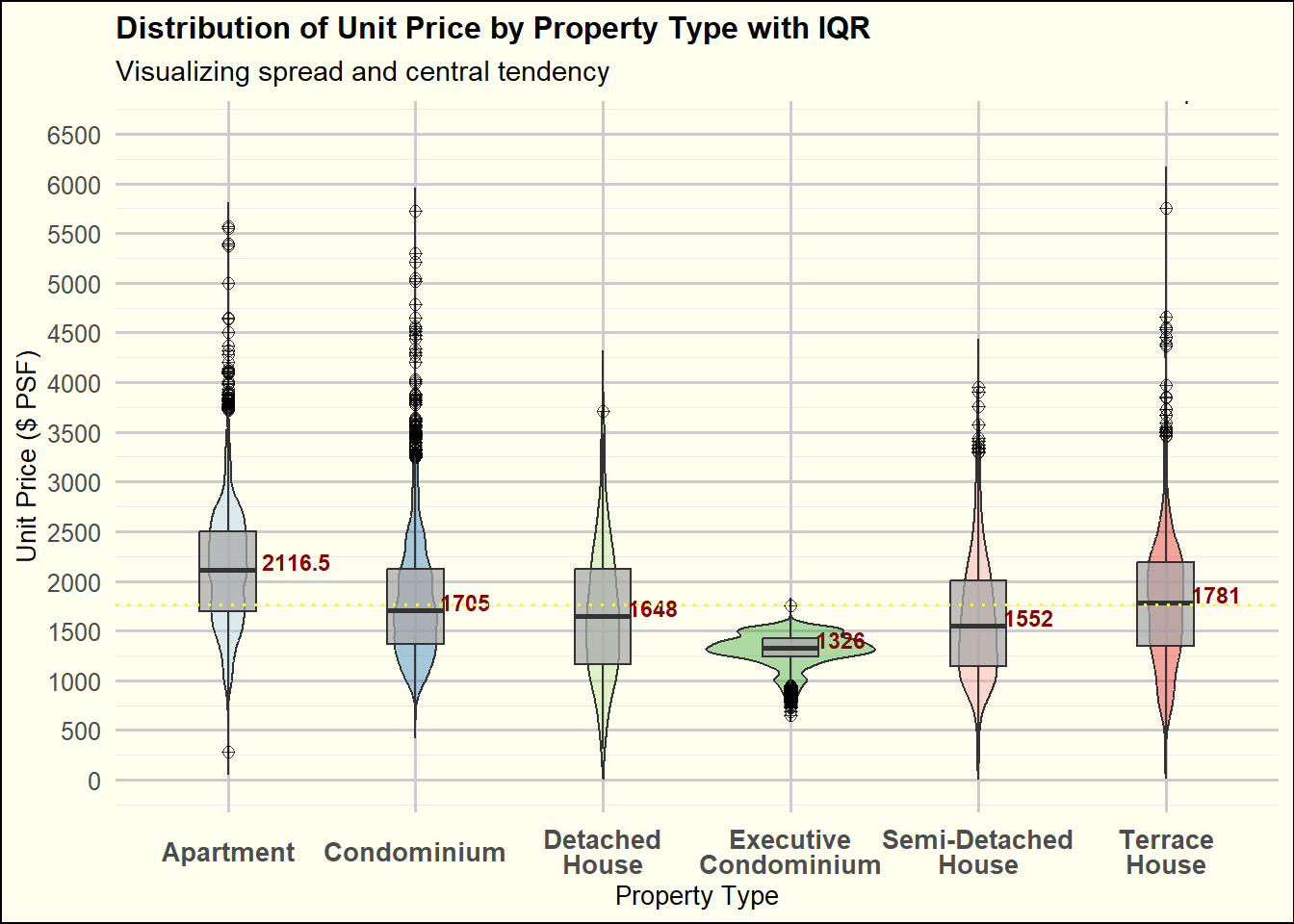
Takeaways
Balancing clarity and aesthetics in a graph is not easy, as a visually appealing design can sometimes compromise clarity.
Practical experience is essential for truly understanding the nuances of coding and chart interactions. There’s often a difference between our initial concepts and the final outputs, highlighting the importance of hands-on experimentation.
Offering critiques on others’ work is not only constructive for them but also serves as a reflection for ourselves. It prompts us to reflect whether we are making similar mistakes in our own visual analytics projects.