pacman::p_load(ggrepel, patchwork,
               ggthemes, hrbrthemes,
tidyverse) Hands on Exercise 2
Getting Started
Load and Install the required R packages
Import Data
exam_data <- read_csv("data/Exam_data.csv")
summary(exam_data)
ID CLASS GENDER RACE
Length:322 Length:322 Length:322 Length:322
Class :character Class :character Class :character Class :character
Mode :character Mode :character Mode :character Mode :character
ENGLISH MATHS SCIENCE
Min. :21.00 Min. : 9.00 Min. :15.00
1st Qu.:59.00 1st Qu.:58.00 1st Qu.:49.25
Median :70.00 Median :74.00 Median :65.00
Mean :67.18 Mean :69.33 Mean :61.16
3rd Qu.:78.00 3rd Qu.:85.00 3rd Qu.:74.75
Max. :96.00 Max. :99.00 Max. :96.00 Annotation: ggrepel
Compare when using annotation
ggplot(data=exam_data,
       aes(x= MATHS,
           y=ENGLISH)) +
  geom_point() +
  geom_smooth(method=lm,
              linewidth=0.5) +
  geom_label(aes(label = ID),
                   fontface = "bold") +
  coord_cartesian(xlim=c(0,100),
                  ylim=c(0,100)) +
  ggtitle("English scores versus Maths scores for Primary 3")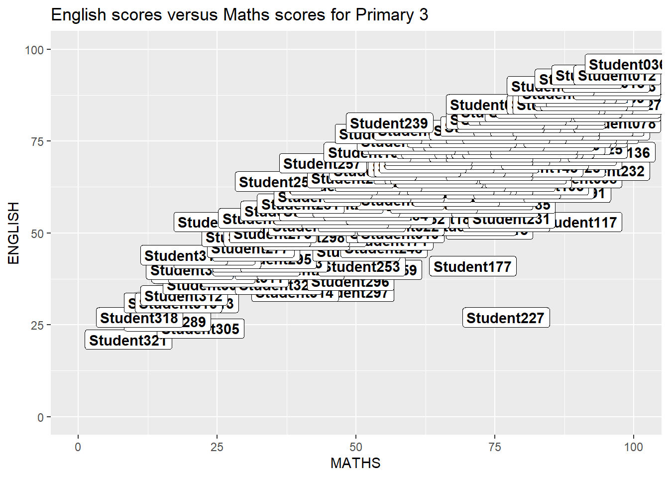
ggplot(data=exam_data,
       aes(x= MATHS,
           y=ENGLISH)) +
  geom_point() +
  geom_smooth(method=lm,
              size=0.5,
              formula = y~x) +
  geom_label_repel(aes(label = ID),
                   fontface = "bold") +
  coord_cartesian(xlim=c(0,100),
                  ylim=c(0,100)) +
  ggtitle("English scores versus Maths scores for Primary 3")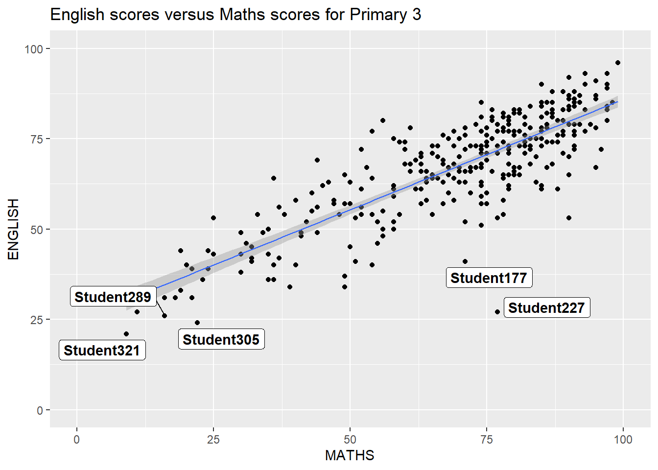
ggplot2 Themes
ggplot(data=exam_data,
             aes(x = MATHS)) +
  geom_histogram(bins=20,
                 boundary = 100,
                 color="yellow2",
                 fill="grey60") +
  theme_classic() +
ggtitle("Distribution of Maths scores") 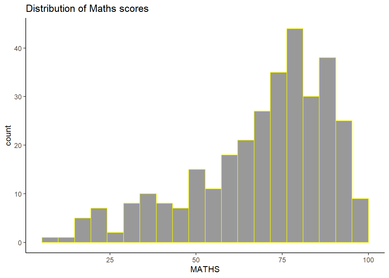
ggtheme package
Using different themes
ggplot(data=exam_data,
             aes(x = MATHS)) +
  geom_histogram(bins=20,
                 boundary = 100,
                 color="grey25",
                 fill="grey90") +
  ggtitle("Distribution of Maths scores") +
  theme_economist()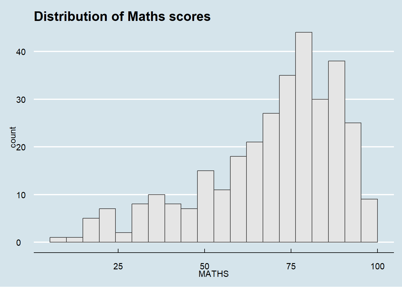
ggplot(data=exam_data,
             aes(x = MATHS)) +
  geom_histogram(bins=20,
                 boundary = 100,
                 color="grey25",
                 fill="grey90") +
  ggtitle("Distribution of Maths scores") +
  theme_wsj()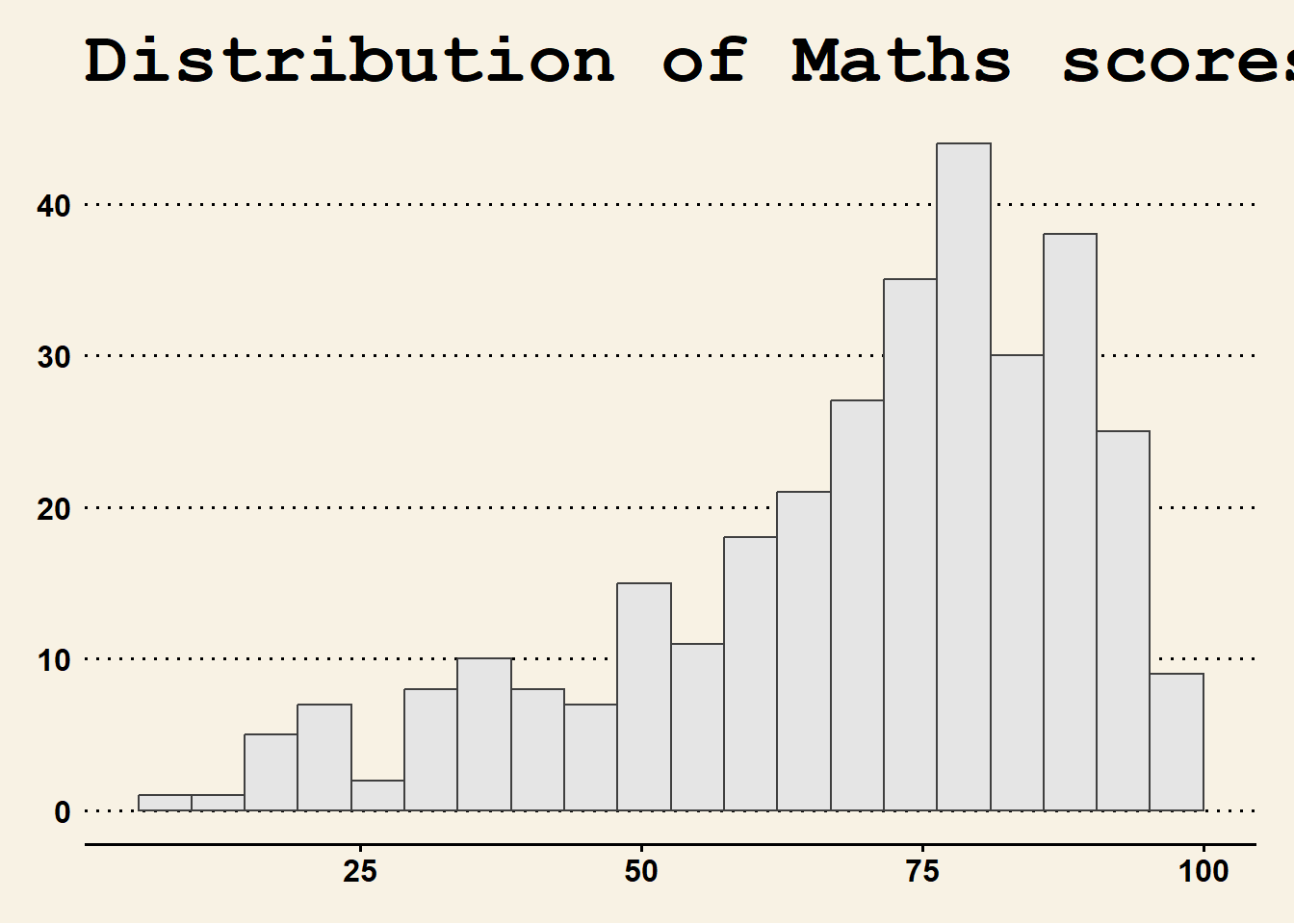
ggplot(data=exam_data,
             aes(x = MATHS)) +
  geom_histogram(bins=20,
                 boundary = 100,
                 color="grey25",
                 fill="grey90") +
  ggtitle("Distribution of Maths scores") +
  theme_solarized()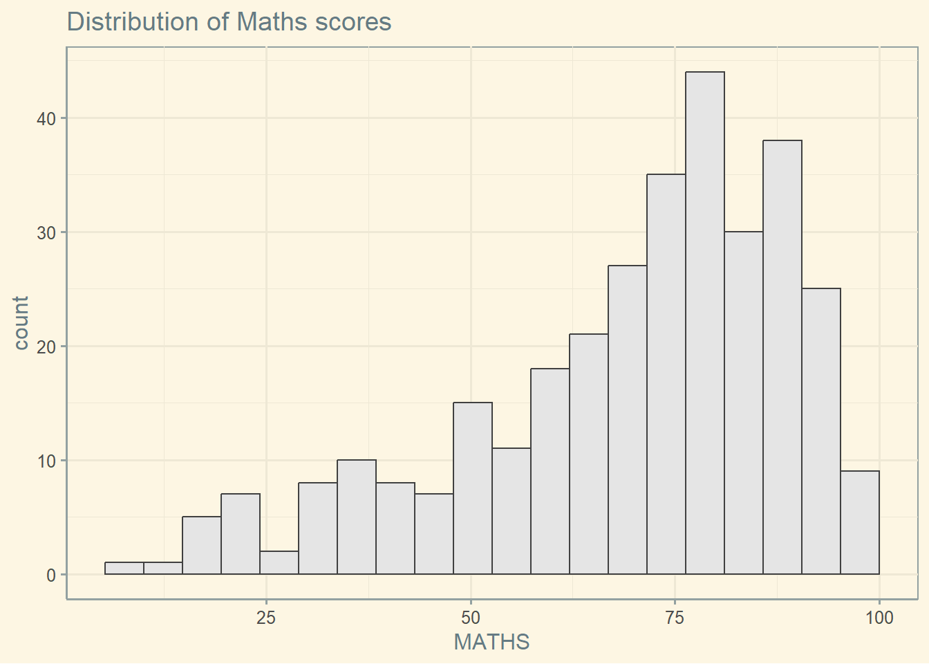
Combining Graphs
Step 1: Create single graphs
p1 <- ggplot(data=exam_data,
aes(x = MATHS)) +
geom_histogram(bins=20,
boundary = 100,
color="grey25",
fill="grey90") +
coord_cartesian(xlim=c(0,100)) +
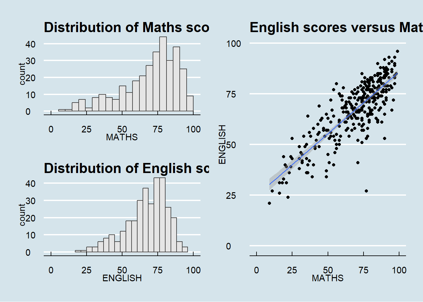
ggtitle("Distribution of Maths scores")p2 <- ggplot(data=exam_data,
aes(x = ENGLISH)) +
geom_histogram(bins=20,
boundary = 100,
color="grey25",
fill="grey90") +
coord_cartesian(xlim=c(0,100)) +
ggtitle("Distribution of English scores")p3 <-
ggplot(data=exam_data,
aes(x= MATHS,
y=ENGLISH)) +
geom_point() +
geom_smooth(method=lm,
size=0.5) +
coord_cartesian(xlim=c(0,100),
ylim=c(0,100)) +
ggtitle("English scores versus Maths scores for Primary 3")Step 2: Combining
(p1 / p2) | p3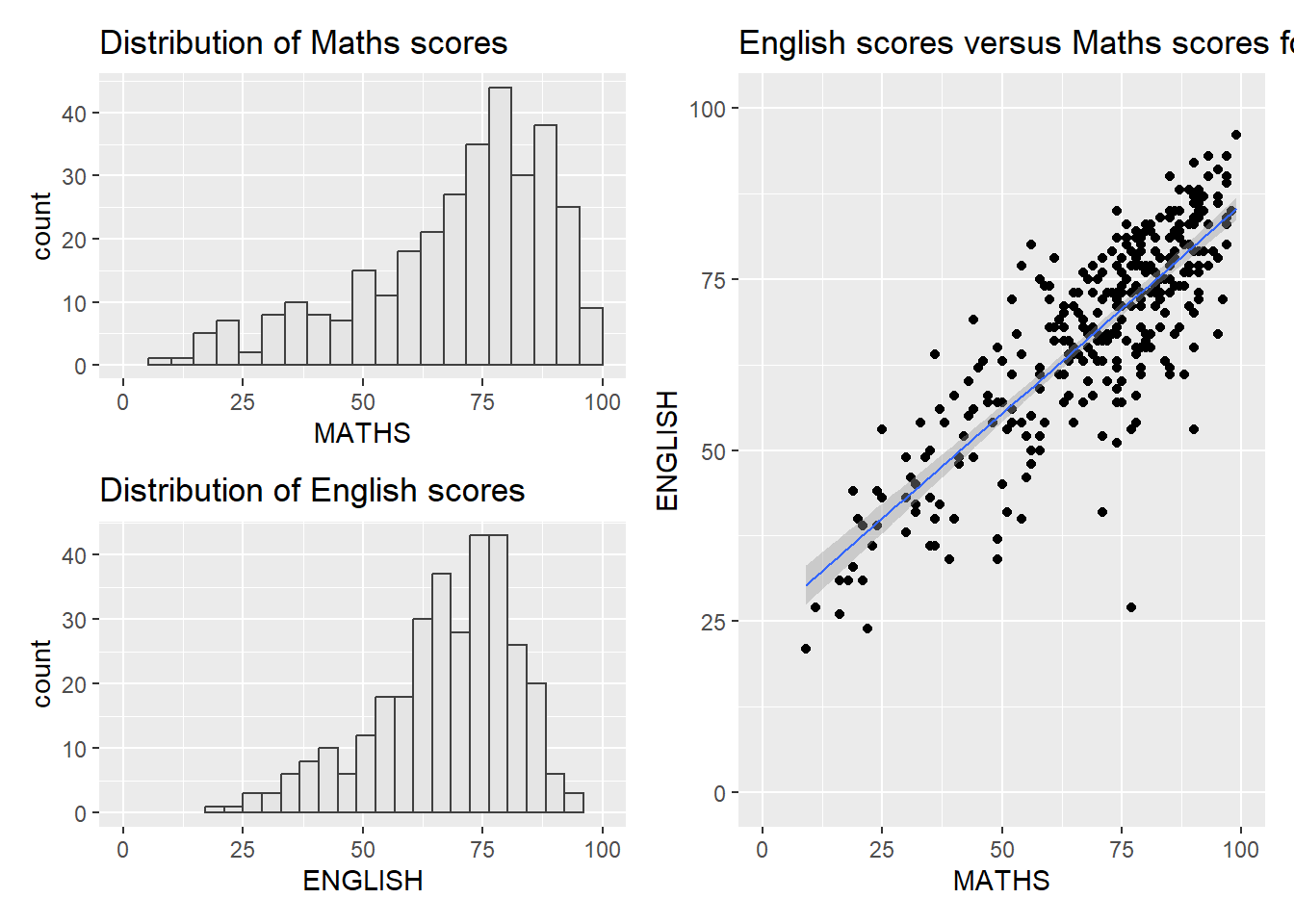
p3 + inset_element(p2,
                   left = 0.02,
                   bottom = 0.7,
                   right = 0.5,
                   top = 1)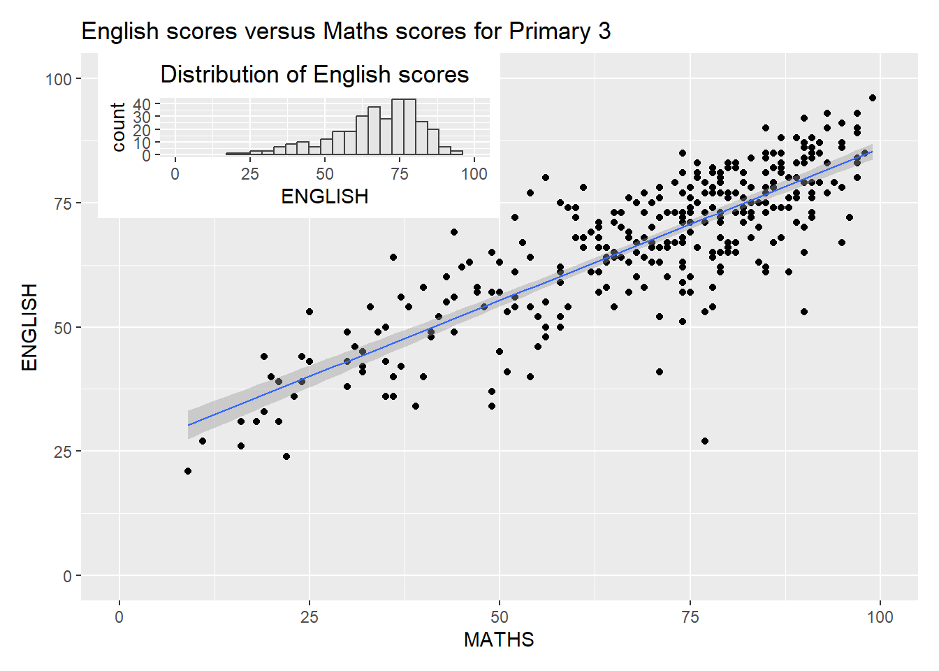
patchwork <- (p1 / p2) | p3
patchwork & theme_economist()