pacman::p_load(ggstatsplot, tidyverse)Hands-on Exercise 4
4.1 Visual Statistical Analysis
Lesson Slides and Hands-on Notes
Getting Started
exam <- read_csv("data/Exam_data.csv")One-sample test: gghistostats() method
set.seed(1234)

gghistostats(
  data = exam,
  x = ENGLISH,
  type = "bayes",
  test.value = 60,
  xlab = "English scores"
)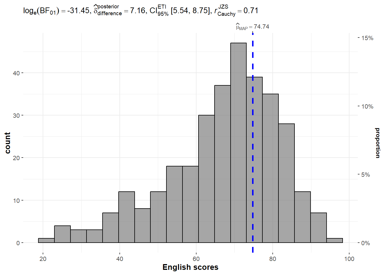
A Bayes factor is the ratio of the likelihood of one particular hypothesis to the likelihood of another. It can be interpreted as a measure of the strength of evidence in favor of one theory among two competing theories.
That’s because the Bayes factor gives us a way to evaluate the data in favor of a null hypothesis, and to use external information to do so. It tells us what the weight of the evidence is in favor of a given hypothesis.
Learn how to interpret Bayes Factor Here.
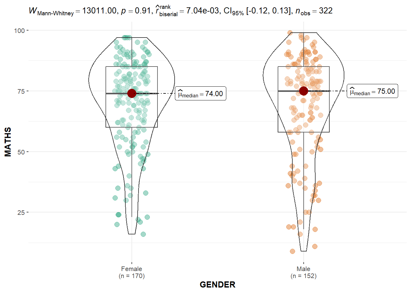
Two-sample mean test: ggbetweenstats()
ggbetweenstats(
  data = exam,
  x = GENDER,
  y = MATHS,
  type = "np",
  messages = FALSE
)
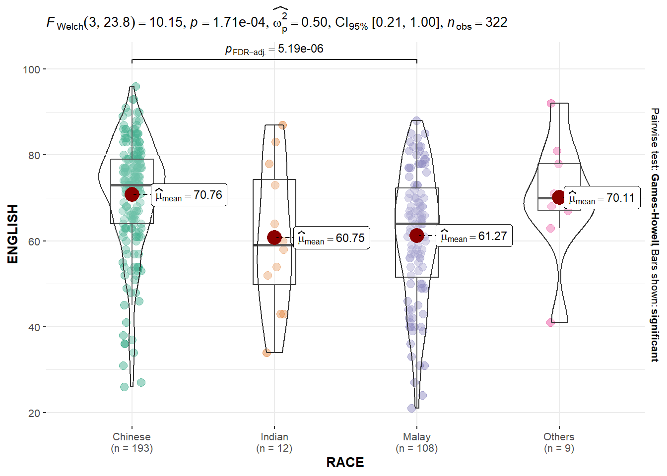
Oneway ANOVA Test: ggbetweenstats() method
ggbetweenstats(
  data = exam,
  x = RACE,
  y = ENGLISH,
  type = "p",
  mean.ci = TRUE,
  pairwise.comparisons = TRUE,
  pairwise.display = "s",
  p.adjust.method = "fdr",
  messages = FALSE
)
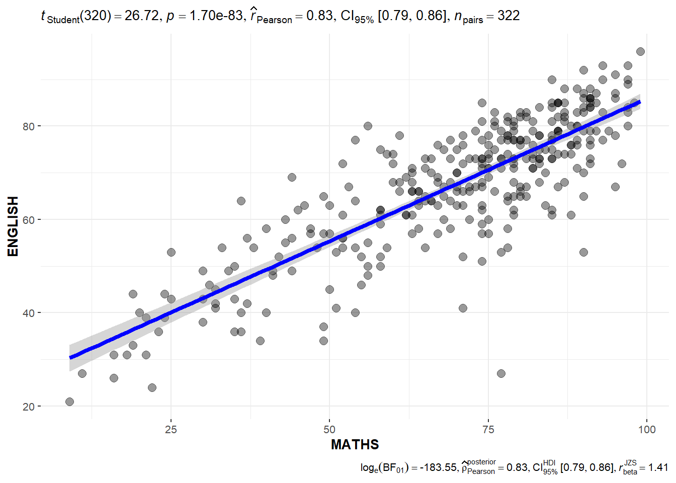
Significant Test of Correlation: ggscatterstats()
ggscatterstats(
  data = exam,
  x = MATHS,
  y = ENGLISH,
  marginal = FALSE,
  )
Significant Test of Association (Depedence) : ggbarstats() methods
exam1 <- exam %>%
  mutate(MATHS_bins =
           cut(MATHS,
               breaks = c(0,60,75,85,100))
)
using ggbarstats
ggbarstats(exam1,
           x = MATHS_bins,
           y = GENDER)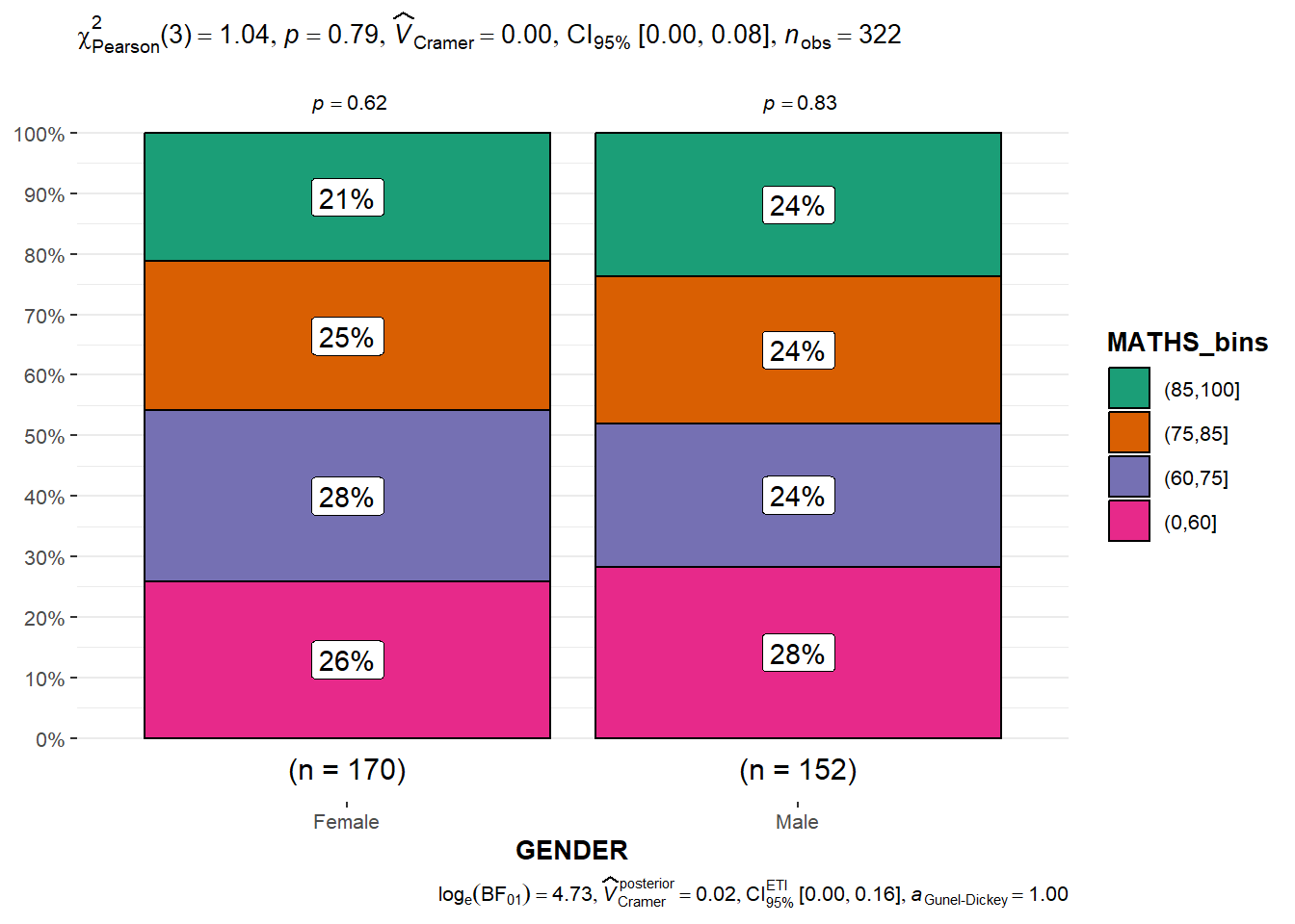
4.1.1 Visualising Models
pacman::p_load(readxl, performance, parameters, see)car_resale <- read_xls("data/ToyotaCorolla.xls",
"data")
car_resale# A tibble: 1,436 × 38
Id Model Price Age_08_04 Mfg_Month Mfg_Year KM Quarterly_Tax Weight
<dbl> <chr> <dbl> <dbl> <dbl> <dbl> <dbl> <dbl> <dbl>
1 81 TOYOTA … 18950 25 8 2002 20019 100 1180
2 1 TOYOTA … 13500 23 10 2002 46986 210 1165
3 2 TOYOTA … 13750 23 10 2002 72937 210 1165
4 3 TOYOTA… 13950 24 9 2002 41711 210 1165
5 4 TOYOTA … 14950 26 7 2002 48000 210 1165
6 5 TOYOTA … 13750 30 3 2002 38500 210 1170
7 6 TOYOTA … 12950 32 1 2002 61000 210 1170
8 7 TOYOTA… 16900 27 6 2002 94612 210 1245
9 8 TOYOTA … 18600 30 3 2002 75889 210 1245
10 44 TOYOTA … 16950 27 6 2002 110404 234 1255
# ℹ 1,426 more rows
# ℹ 29 more variables: Guarantee_Period <dbl>, HP_Bin <chr>, CC_bin <chr>,
# Doors <dbl>, Gears <dbl>, Cylinders <dbl>, Fuel_Type <chr>, Color <chr>,
# Met_Color <dbl>, Automatic <dbl>, Mfr_Guarantee <dbl>,
# BOVAG_Guarantee <dbl>, ABS <dbl>, Airbag_1 <dbl>, Airbag_2 <dbl>,
# Airco <dbl>, Automatic_airco <dbl>, Boardcomputer <dbl>, CD_Player <dbl>,
# Central_Lock <dbl>, Powered_Windows <dbl>, Power_Steering <dbl>, …Multiple Regression Model using lm()
model <- lm(Price ~ Age_08_04 + Mfg_Year + KM +
              Weight + Guarantee_Period, data = car_resale)
model
Call:
lm(formula = Price ~ Age_08_04 + Mfg_Year + KM + Weight + Guarantee_Period,
    data = car_resale)

Coefficients:
     (Intercept)         Age_08_04          Mfg_Year                KM
      -2.637e+06        -1.409e+01         1.315e+03        -2.323e-02
          Weight  Guarantee_Period
       1.903e+01         2.770e+01
Model Diagnostic: checking for multicolinearity
check_collinearity(model)# Check for Multicollinearity
Low Correlation
Term VIF VIF 95% CI Increased SE Tolerance Tolerance 95% CI
KM 1.46 [ 1.37, 1.57] 1.21 0.68 [0.64, 0.73]
Weight 1.41 [ 1.32, 1.51] 1.19 0.71 [0.66, 0.76]
Guarantee_Period 1.04 [ 1.01, 1.17] 1.02 0.97 [0.86, 0.99]
High Correlation
Term VIF VIF 95% CI Increased SE Tolerance Tolerance 95% CI
Age_08_04 31.07 [28.08, 34.38] 5.57 0.03 [0.03, 0.04]
Mfg_Year 31.16 [28.16, 34.48] 5.58 0.03 [0.03, 0.04]check_c <- check_collinearity(model)
plot(check_c)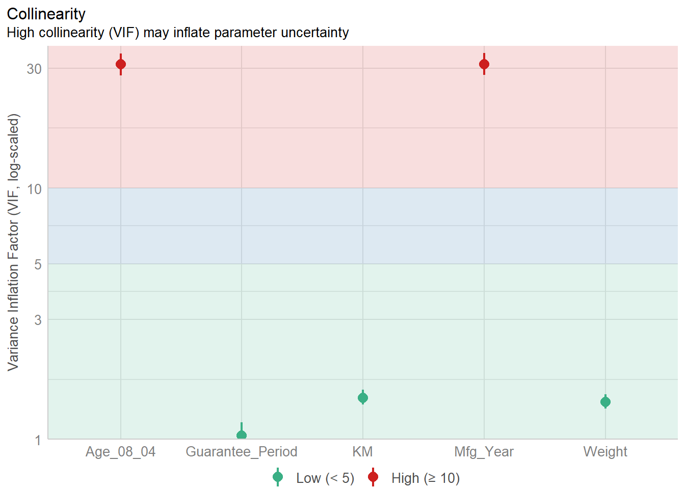
Model Diagnostic: checking normality assumption
model1 <- lm(Price ~ Age_08_04 + KM +
              Weight + Guarantee_Period, data = car_resale)
check_n <- check_normality(model1)plot(check_n)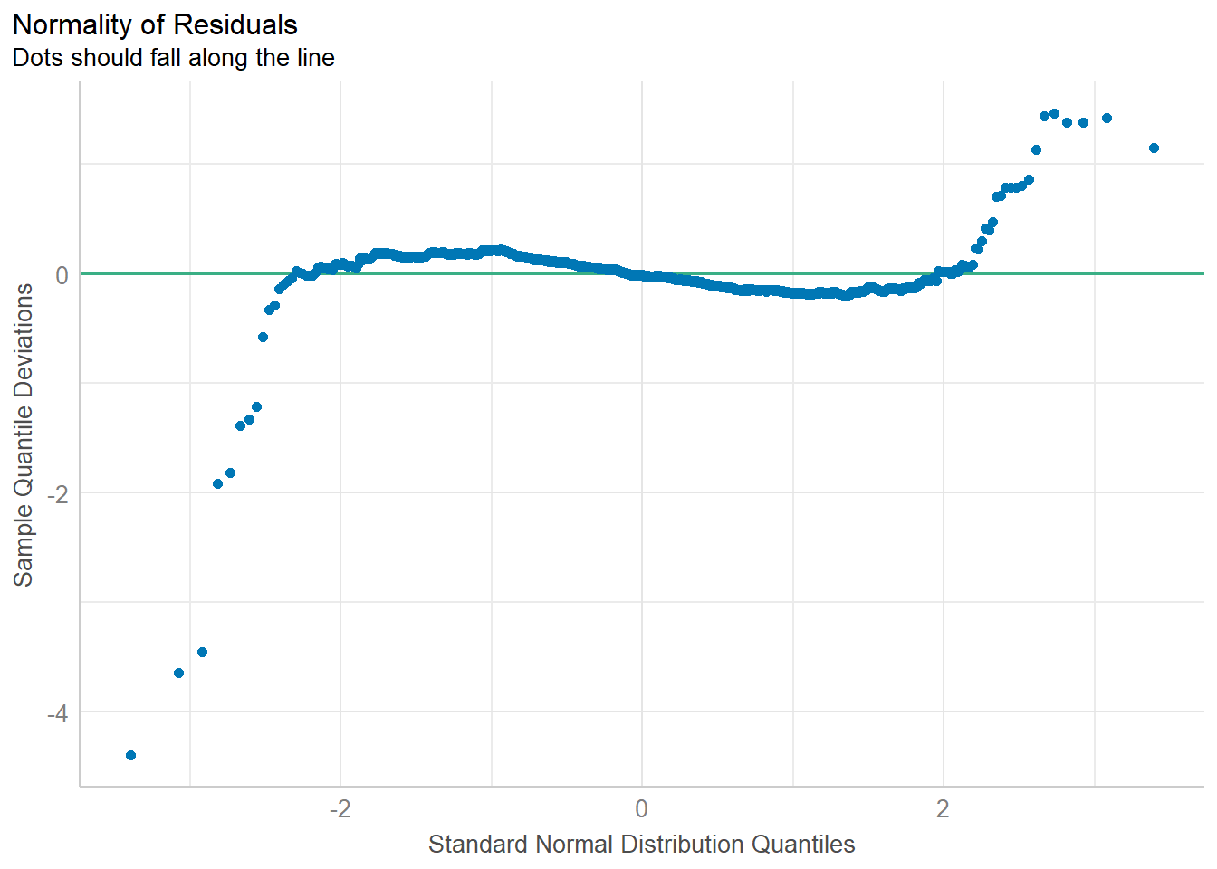
Model Diagnostic: Check model for homogeneity of variances
check_h <- check_heteroscedasticity(model1)plot(check_h)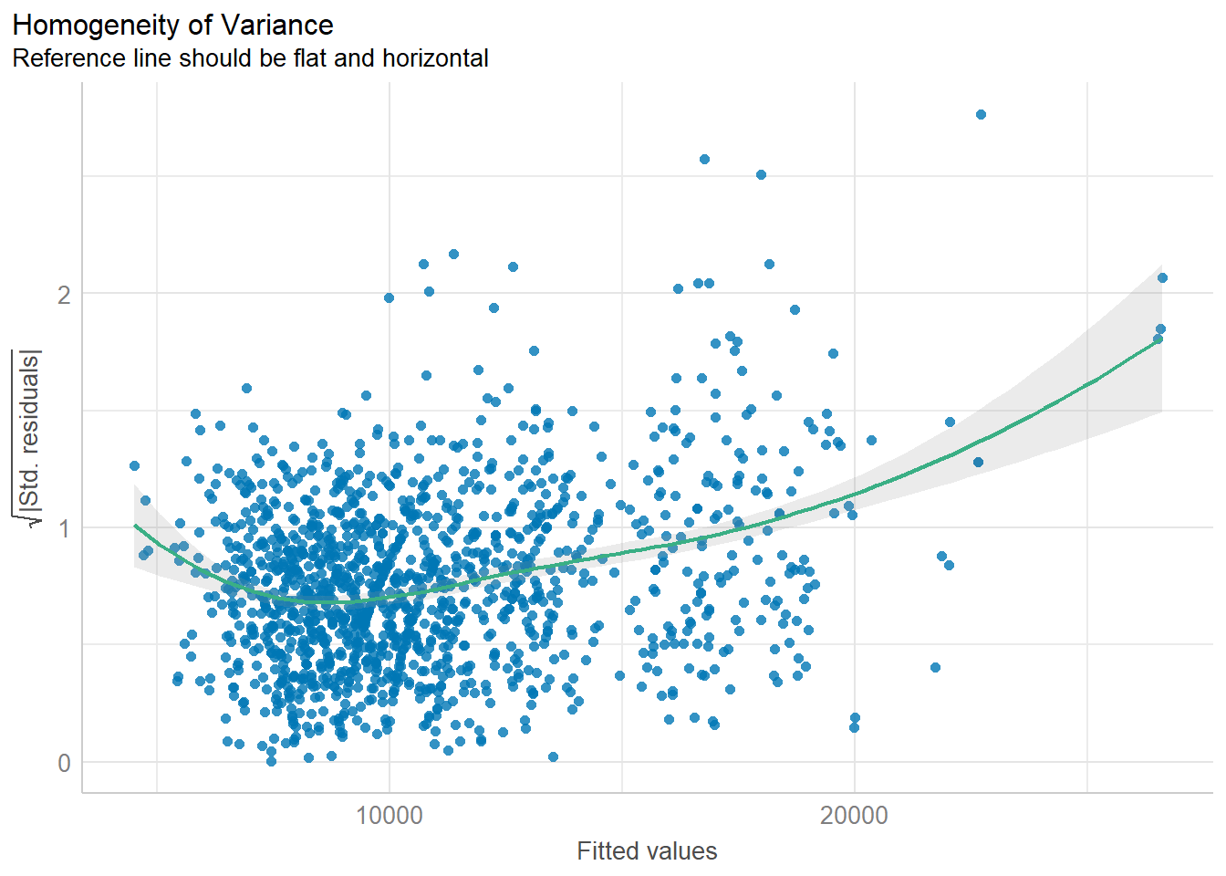
Model Diagnostic: Complete check
check_model(model1)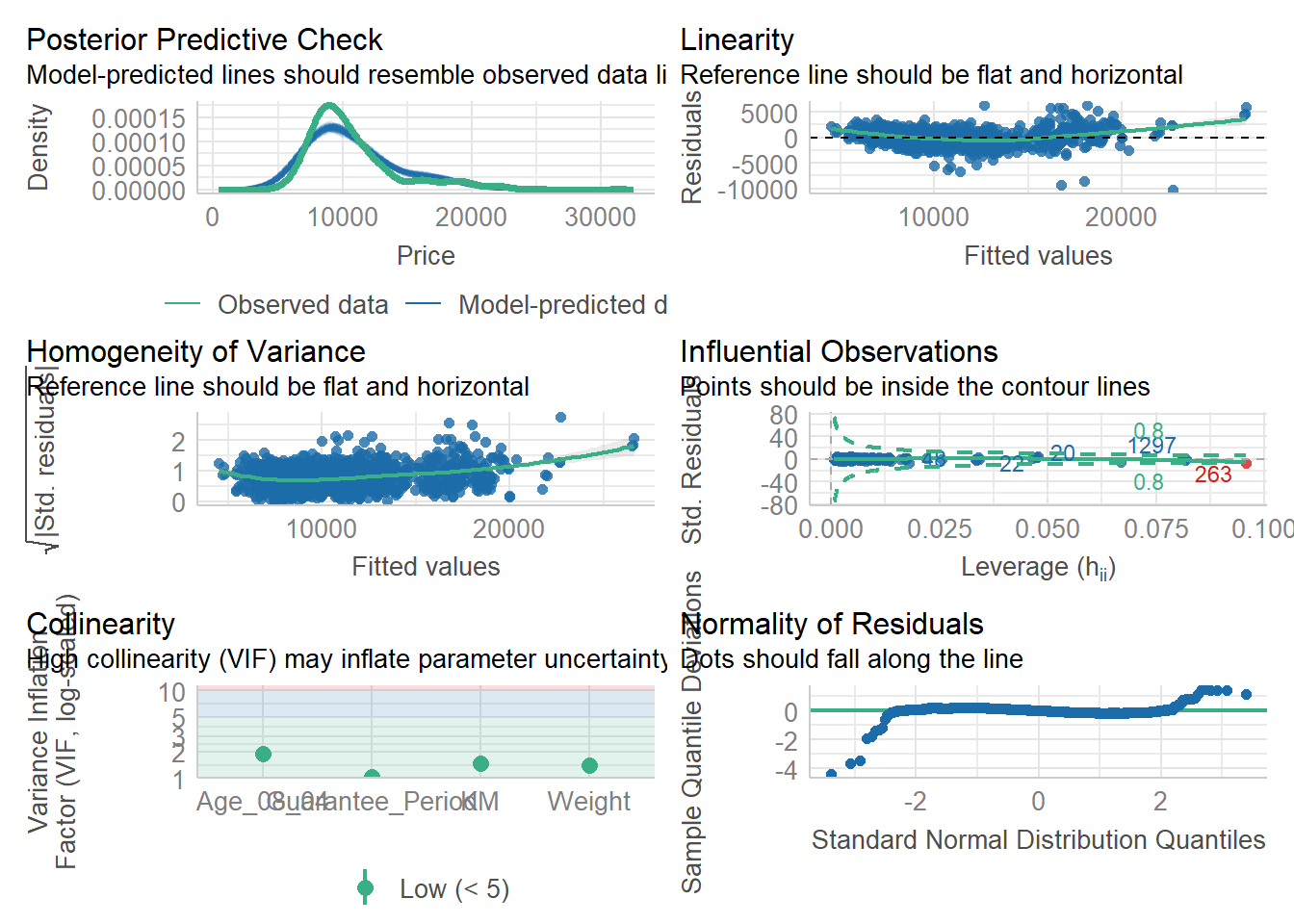
Visualising Regression Parameters: see methods
plot(parameters(model1))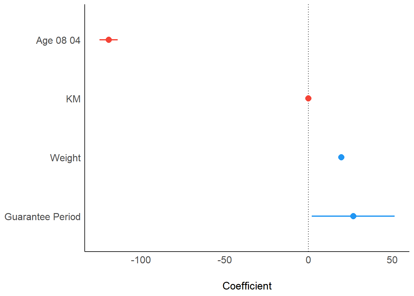
Visualising Regression Parameters: ggcoefstats() methods
ggcoefstats(model1,
            output = "plot")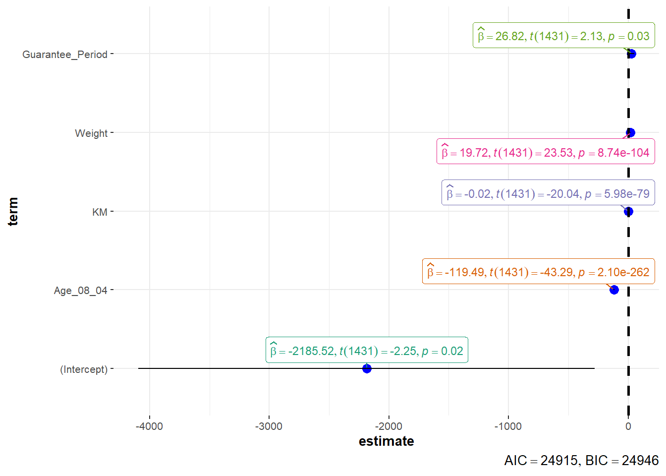
4.2 Visualising Uncertainty
devtools::install_github("wilkelab/ungeviz")pacman::p_load(ungeviz, plotly, crosstalk,
DT, ggdist, ggridges,
colorspace, gganimate, tidyverse)exam <- read_csv("data/Exam_data.csv")Visualizing the uncertainty of point estimates: ggplot2 methods
Important: Don’t confuse the uncertainty of a point estimate with the variation in the sample
my_sum <- exam %>%
  group_by(RACE) %>%
  summarise(
    n=n(),
    mean=mean(MATHS),
    sd=sd(MATHS)
    ) %>%
mutate(se=sd/sqrt(n-1))- group_by() of dplyr package is used to group the observation by RACE,
- summarise() is used to compute the count of observations, mean, standard deviation
- mutate() is used to derive standard error of Maths by RACE, and
- the output is save as a tibble data table called my_sum.
knitr::kable(head(my_sum), format = 'html')| RACE | n | mean | sd | se |
|---|---|---|---|---|
| Chinese | 193 | 76.50777 | 15.69040 | 1.132357 |
| Indian | 12 | 60.66667 | 23.35237 | 7.041005 |
| Malay | 108 | 57.44444 | 21.13478 | 2.043177 |
| Others | 9 | 69.66667 | 10.72381 | 3.791438 |
Plotting standard error bars of point estimates
ggplot(my_sum) +
  geom_errorbar(
    aes(x=RACE,
        ymin=mean-se,
        ymax=mean+se),
    width=0.2,
    colour="black",
    alpha=0.9,
    size=0.5) +
  geom_point(aes
           (x=RACE,
            y=mean),
           stat="identity",
           color="red",
           size = 1.5,
           alpha=1) +
  ggtitle("Standard error of mean maths score by rac")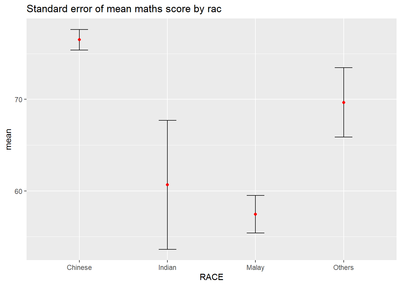
Plotting confidence interval of point estimates
ggplot(my_sum) +
  geom_errorbar(
    aes(x=reorder(RACE, -mean),
        ymin=mean-1.96*se,
        ymax=mean+1.96*se),
    width=0.2,
    colour="black",
    alpha=0.9,
    size=0.5) +
  geom_point(aes
           (x=RACE,
            y=mean),
           stat="identity",
           color="red",
           size = 1.5,
           alpha=1) +
  labs(x = "Maths score",
       title = "95% confidence interval of mean maths score by race")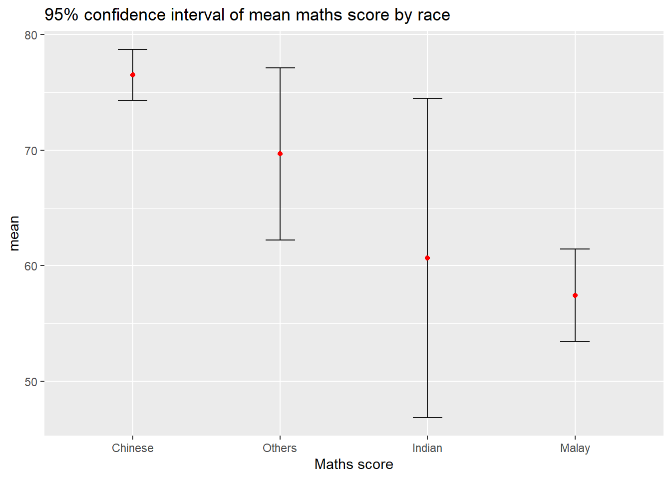
Visualizing the uncertainty of point estimates with interactive error bars
shared_df = SharedData$new(my_sum)

bscols(widths = c(4,8),
       ggplotly((ggplot(shared_df) +
                   geom_errorbar(aes(
                     x=reorder(RACE, -mean),
                     ymin=mean-2.58*se,
                     ymax=mean+2.58*se),
                     width=0.2,
                     colour="black",
                     alpha=0.9,
                     size=0.5) +
                   geom_point(aes(
                     x=RACE,
                     y=mean,
                     text = paste("Race:", `RACE`,
                                  "<br>N:", `n`,
                                  "<br>Avg. Scores:", round(mean, digits = 2),
                                  "<br>95% CI:[",
                                  round((mean-2.58*se), digits = 2), ",",
                                  round((mean+2.58*se), digits = 2),"]")),
                     stat="identity",
                     color="red",
                     size = 1.5,
                     alpha=1) +
                   xlab("Race") +
                   ylab("Average Scores") +
                   theme_minimal() +
                   theme(axis.text.x = element_text(
                     angle = 45, vjust = 0.5, hjust=1)) +
                   ggtitle("99% Confidence interval of average /<br>maths scores by race")),
                tooltip = "text"),
       DT::datatable(shared_df,
                     rownames = FALSE,
                     class="compact",
                     width="100%",
                     options = list(pageLength = 10,
                                    scrollX=T),
                     colnames = c("No. of pupils",
                                  "Avg Scores",
                                  "Std Dev",
                                  "Std Error")) %>%
         formatRound(columns=c('mean', 'sd', 'se'),
                     digits=2))
Visualising Uncertainty: ggdist package
ggdist is an R package that provides a flexible set of ggplot2 geoms and stats designed especially for visualising distributions and uncertainty.
It is designed for both frequentist and Bayesian uncertainty visualization, taking the view that uncertainty visualization can be unified through the perspective of distribution visualization:
for frequentist models, one visualises confidence distributions or bootstrap distributions (see vignette(“freq-uncertainty-vis”));
for Bayesian models, one visualises probability distributions (see the tidybayes package, which builds on top of ggdist).
Visualizing the uncertainty of point estimates: ggdist methods
In the code chunk below, stat_pointinterval() of ggdist is used to build a visual for displaying distribution of maths scores by race.
exam %>%
  ggplot(aes(x = RACE,
             y = MATHS)) +
  stat_pointinterval() +
  labs(
    title = "Visualising confidence intervals of mean math score",
    subtitle = "Mean Point + Multiple-interval plot")
For example, in the code chunk below the following arguments are used:
.width = 0.95 .point = median .interval = qi
exam %>%
  ggplot(aes(x = RACE, y = MATHS)) +
  stat_pointinterval(.width = 0.95,
  .point = median,
  .interval = qi) +
  labs(
    title = "Visualising confidence intervals of median math score",
    subtitle = "Median Point + Multiple-interval plot")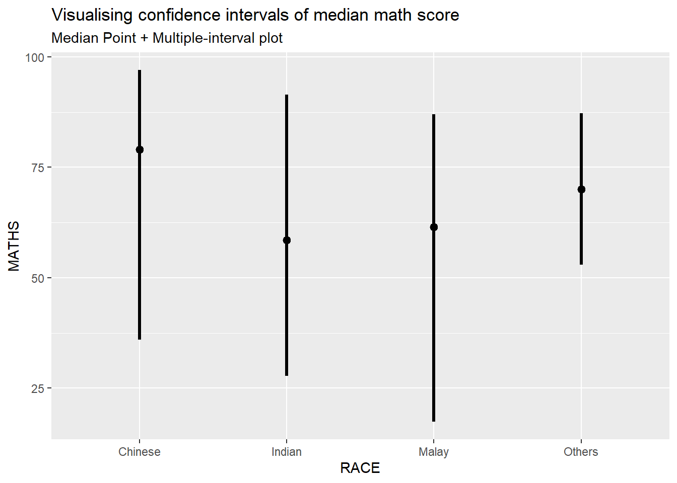
Visualizing the uncertainty of point estimates: ggdist methods
exam %>%
  ggplot(aes(x = RACE,
             y = MATHS)) +
  stat_pointinterval(
    show.legend = FALSE) +
  labs(
    title = "Visualising confidence intervals of mean math score",
    subtitle = "Mean Point + Multiple-interval plot")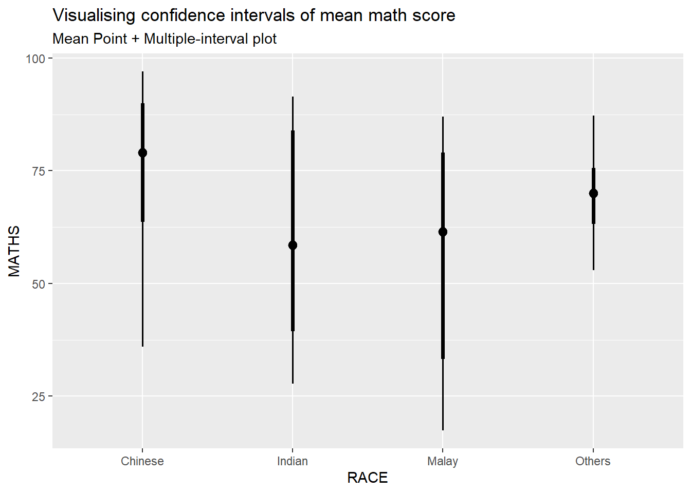
Visualizing the uncertainty of point estimates: ggdist methods
In the code chunk below, stat_gradientinterval() of ggdist is used to build a visual for displaying distribution of maths scores by race.
exam %>%
  ggplot(aes(x = RACE,
             y = MATHS)) +
  stat_gradientinterval(
    fill = "skyblue",
    show.legend = TRUE
  ) +
  labs(
    title = "Visualising confidence intervals of mean math score",
    subtitle = "Gradient + interval plot")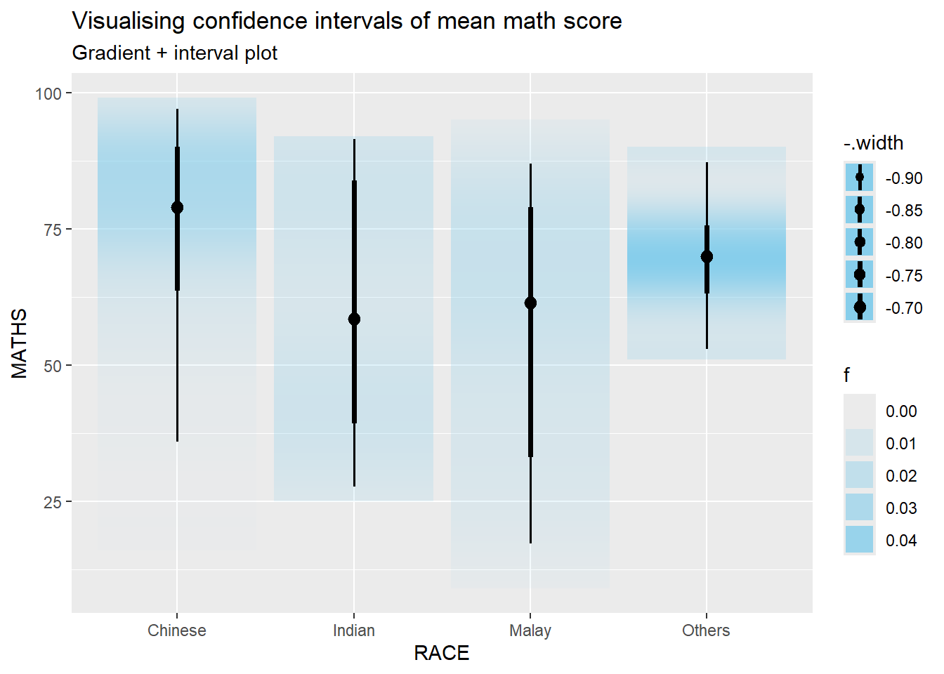
Visualising Uncertainty with Hypothetical Outcome Plots (HOPs)
devtools::install_github("wilkelab/ungeviz")library(ungeviz)ggplot(data = exam,
(aes(x = factor(RACE), y = MATHS))) +
geom_point(position = position_jitter(
height = 0.3, width = 0.05),
size = 0.4, color = "#0072B2", alpha = 1/2) +
geom_hpline(data = sampler(25, group = RACE), height = 0.6, color = "#D55E00") +
theme_bw() +
# `.draw` is a generated column indicating the sample draw
transition_states(.draw, 1, 3)NULLVisualising Uncertainty with Hypothetical Outcome Plots (HOPs)
ggplot(data = exam,
       (aes(x = factor(RACE),
            y = MATHS))) +
  geom_point(position = position_jitter(
    height = 0.3,
    width = 0.05),
    size = 0.4,
    color = "#0072B2",
    alpha = 1/2) +
  geom_hpline(data = sampler(25,
                             group = RACE),
              height = 0.6,
              color = "#D55E00") +
  theme_bw() +
transition_states(.draw, 1, 3)NULL4.3 Funnel Plots for Fair Comparisons
Funnel plot is a specially designed data visualisation for conducting unbiased comparison between outlets, stores or business entities. By the end of this hands-on exercise, you will gain hands-on experience on:
plotting funnel plots by using funnelPlotR package,
plotting static funnel plot by using ggplot2 package, and
plotting interactive funnel plot by using both plotly R and ggplot2 packages.
pacman::p_load(tidyverse, FunnelPlotR, plotly, knitr)library(FunnelPlotR) covid19 <- read_csv("data/COVID-19_DKI_Jakarta.csv") %>%
mutate_if(is.character, as.factor)funnel_plot(
.data = covid19,
numerator = Positive,
denominator = Death,
group = `Sub-district`
)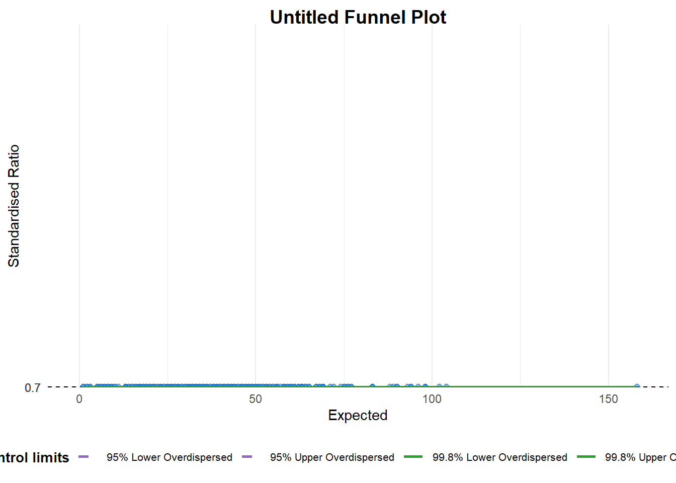
A funnel plot object with 267 points of which 0 are outliers.
Plot is adjusted for overdispersion.
A funnel plot object with 267 points of which 0 are outliers. Plot is adjusted for overdispersion. Things to learn from the code chunk above.
groupin this function is different from the scatter plot. Here, it defines the level of the points to be plotted i.e. Sub-district, District or City. If Cityc is chosen, there are only six data points.By default,
data_typeargument is “SR”.limit: Plot limits, accepted values are: 95 or 99, corresponding to 95% or 99.8% quantiles of the distribution.
FunnelPlotR methods: Makeover 1
funnel_plot(
  .data = covid19,
  numerator = Death,
  denominator = Positive,
  group = `Sub-district`,
  data_type = "PR",     #<<
  xrange = c(0, 6500),  #<<
  yrange = c(0, 0.05)   #<<
)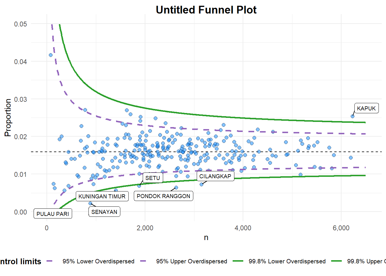
A funnel plot object with 267 points of which 7 are outliers.
Plot is adjusted for overdispersion.
A funnel plot object with 267 points of which 7 are outliers. Plot is adjusted for overdispersion. Things to learn from the code chunk above. + data_type argument is used to change from default “SR” to “PR” (i.e.proportions). + xrange and yrange are used to set the range of x-axis and y-axis
FunnelPlotR methods: Makeover 2
funnel_plot(
  .data = covid19,
  numerator = Death,
  denominator = Positive,
  group = `Sub-district`,
  data_type = "PR",
  xrange = c(0, 6500),
  yrange = c(0, 0.05),
  label = NA,
  title = "Cumulative COVID-19 Fatality Rate by Cumulative Total Number of COVID-19 Positive Cases", #<<
  x_label = "Cumulative COVID-19 Positive Cases", #<<
  y_label = "Cumulative Fatality Rate"  #<<
)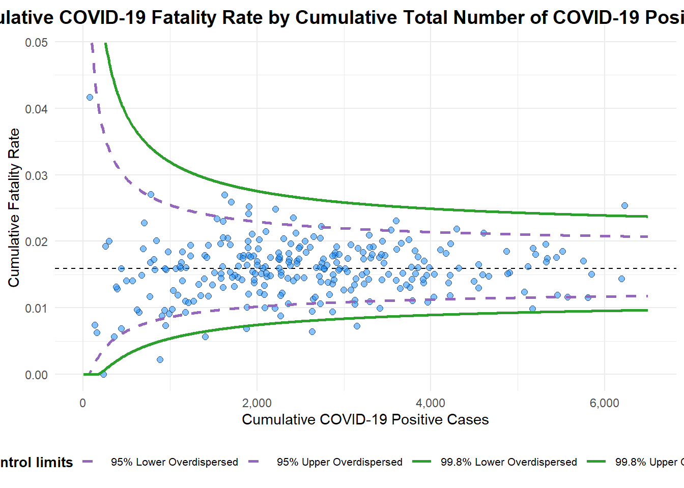
A funnel plot object with 267 points of which 7 are outliers.
Plot is adjusted for overdispersion.
A funnel plot object with 267 points of which 7 are outliers. Plot is adjusted for overdispersion. Things to learn from the code chunk above.
label = NAargument is to removed the default label outliers feature.titleargument is used to add plot title.x_labelandy_labelarguments are used to add/edit x-axis and y-axis titles.
Funnel Plot for Fair Visual Comparison: ggplot2 methods
Computing the basic derived fields
funnel_plot(
  .data = covid19,
  numerator = "Positive",
  denominator = "Death",
  group = "Sub-district"
  )
A funnel plot object with 267 points of which 0 are outliers.
Plot is adjusted for overdispersion.
df <- covid19 %>%
mutate(rate = Death / Positive) %>%
mutate(rate.se = sqrt((rate*(1-rate)) / (Positive))) %>%
filter(rate > 0)fit.mean <- weighted.mean(df$rate, 1/df$rate.se^2)Calculate lower and upper limits for 95% and 99.9% CI
number.seq <- seq(1, max(df$Positive), 1)
number.ll95 <- fit.mean - 1.96 * sqrt((fit.mean*(1-fit.mean)) / (number.seq))
number.ul95 <- fit.mean + 1.96 * sqrt((fit.mean*(1-fit.mean)) / (number.seq))
number.ll999 <- fit.mean - 3.29 * sqrt((fit.mean*(1-fit.mean)) / (number.seq))
number.ul999 <- fit.mean + 3.29 * sqrt((fit.mean*(1-fit.mean)) / (number.seq))
dfCI <- data.frame(number.ll95, number.ul95, number.ll999,
                   number.ul999, number.seq, fit.mean)
Plotting a static funnel plot
p <- ggplot(df, aes(x = Positive, y = rate)) +
  geom_point(aes(label=`Sub-district`),
             alpha=0.4) +
  geom_line(data = dfCI,
            aes(x = number.seq,
                y = number.ll95),
            size = 0.4,
            colour = "grey40",
            linetype = "dashed") +
  geom_line(data = dfCI,
            aes(x = number.seq,
                y = number.ul95),
            size = 0.4,
            colour = "grey40",
            linetype = "dashed") +
  geom_line(data = dfCI,
            aes(x = number.seq,
                y = number.ll999),
            size = 0.4,
            colour = "grey40") +
  geom_line(data = dfCI,
            aes(x = number.seq,
                y = number.ul999),
            size = 0.4,
            colour = "grey40") +
  geom_hline(data = dfCI,
             aes(yintercept = fit.mean),
             size = 0.4,
             colour = "grey40") +
  coord_cartesian(ylim=c(0,0.05)) +
  annotate("text", x = 1, y = -0.13, label = "95%", size = 3, colour = "grey40") +
  annotate("text", x = 4.5, y = -0.18, label = "99%", size = 3, colour = "grey40") +
  ggtitle("Cumulative Fatality Rate by Cumulative Number of COVID-19 Cases") +
  xlab("Cumulative Number of COVID-19 Cases") +
  ylab("Cumulative Fatality Rate") +
  theme_light() +
  theme(plot.title = element_text(size=12),
        legend.position = c(0.91,0.85),
        legend.title = element_text(size=7),
        legend.text = element_text(size=7),
        legend.background = element_rect(colour = "grey60", linetype = "dotted"),
        legend.key.height = unit(0.3, "cm"))
p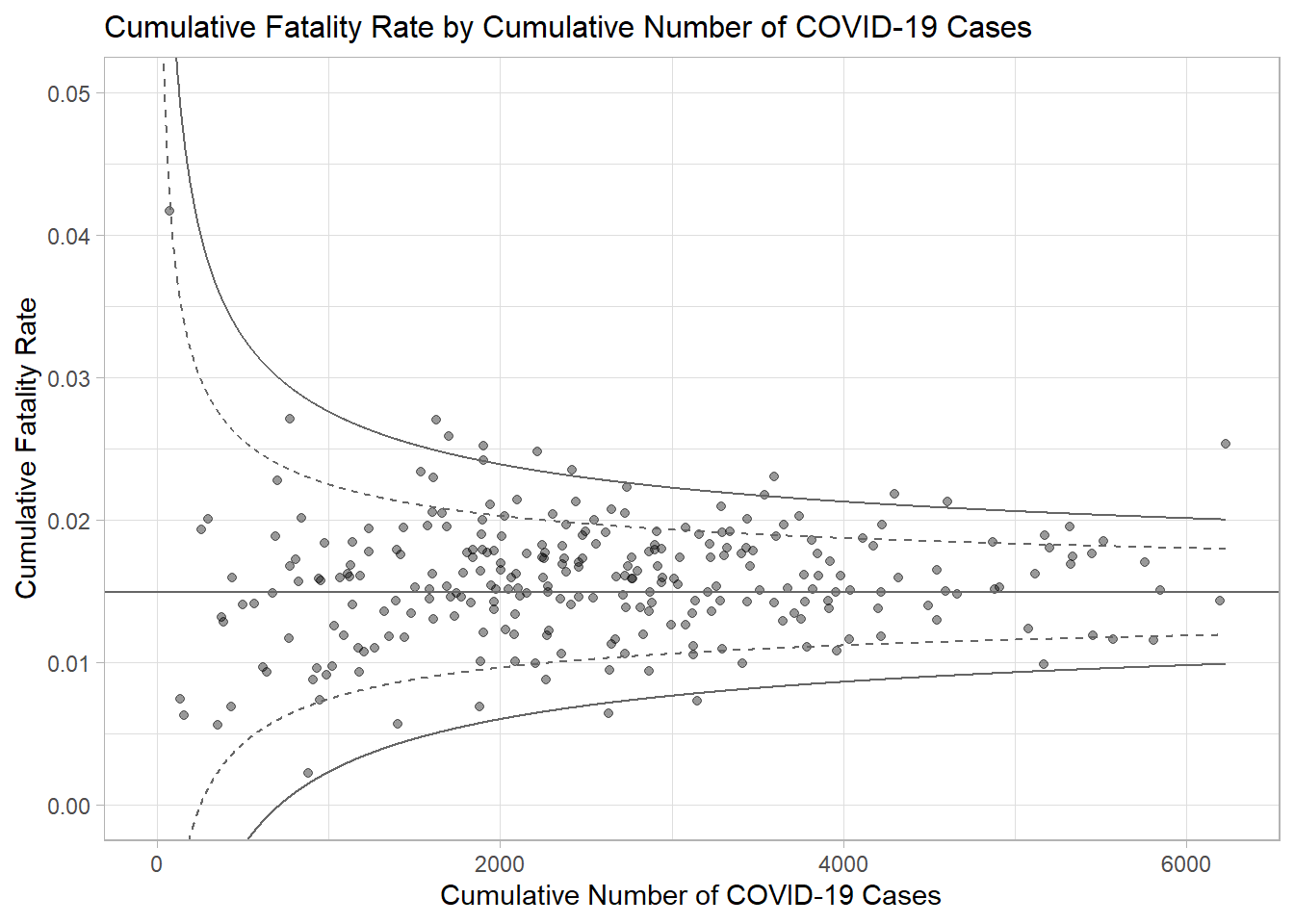
Interactive Funnel Plot: plotly + ggplot2
fp_ggplotly <- ggplotly(p,
  tooltip = c("label",
              "x",
              "y"))
fp_ggplotly
4.4 Good Reads
4.5 References
funnelPlotR package.
ggplot2 package.
4.6 Readings on Visualising Uncertainty
Error Plots
Funnel Plots
All About Tableau
Visualising Uncertainty
All about R
ggstatsplot: An extension of ggplot2 package for creating statistical graphics with details from statistical tests.
ggdist: An R package that provides a flexible set of ggplot2 geoms and stats designed especially for visualising distributions and uncertainty.
performance: An R package provides utilities for computing indices of model quality and goodness of fit including provides many functions to check model assumptions visually.
infer: An R package specially designed to perform statistical inference using an expressive statistical grammar that coheres with the tidyverse design framework. The library also includes functions for visualising the distribution of the simulation-based inferential statistics or the theoretical distribution (or both).