pacman::p_load(tidyverse, forcats)Hands on Exercise 1
Getting Started
Load and Install R packages
Import Data
exam_data <- read_csv("data/Exam_data.csv")
summary(exam_data)
ID CLASS GENDER RACE
Length:322 Length:322 Length:322 Length:322
Class :character Class :character Class :character Class :character
Mode :character Mode :character Mode :character Mode :character
ENGLISH MATHS SCIENCE
Min. :21.00 Min. : 9.00 Min. :15.00
1st Qu.:59.00 1st Qu.:58.00 1st Qu.:49.25
Median :70.00 Median :74.00 Median :65.00
Mean :67.18 Mean :69.33 Mean :61.16
3rd Qu.:78.00 3rd Qu.:85.00 3rd Qu.:74.75
Max. :96.00 Max. :99.00 Max. :96.00 #Introductions to ggplot The aesthetic mappings take attributes of the data and and use them to influence visual characteristics, such as position, colour, size, shape, or transparency. Each visual characteristic can thus encode an aspect of the data and be used to convey information.
Bar chart
ggplot(data=exam_data,
       aes(x=RACE)) +
  geom_bar()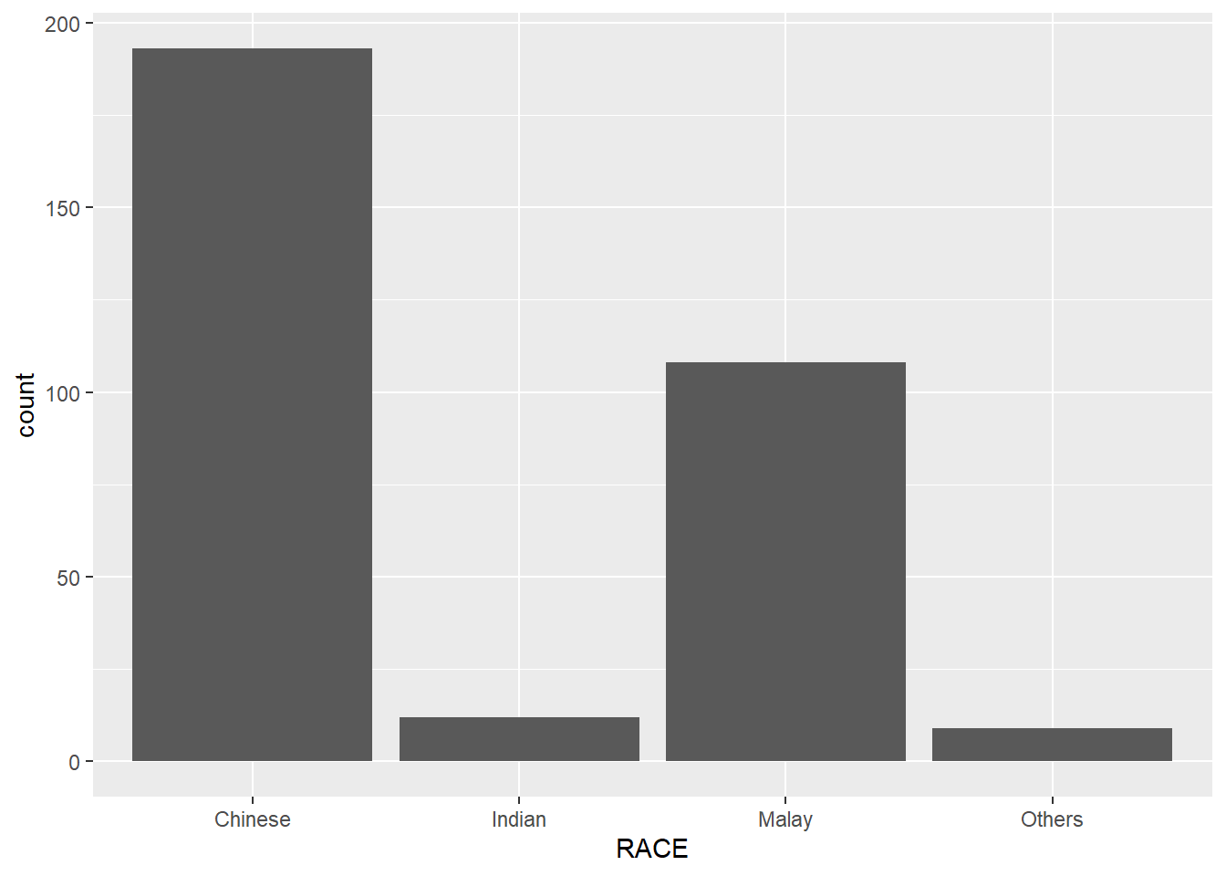
Dot Plot
ggplot(data=exam_data,
       aes(x = MATHS)) +
  geom_dotplot(binwidth=2.5,
               dotsize = 0.5) +
  scale_y_continuous(NULL,
breaks = NULL) 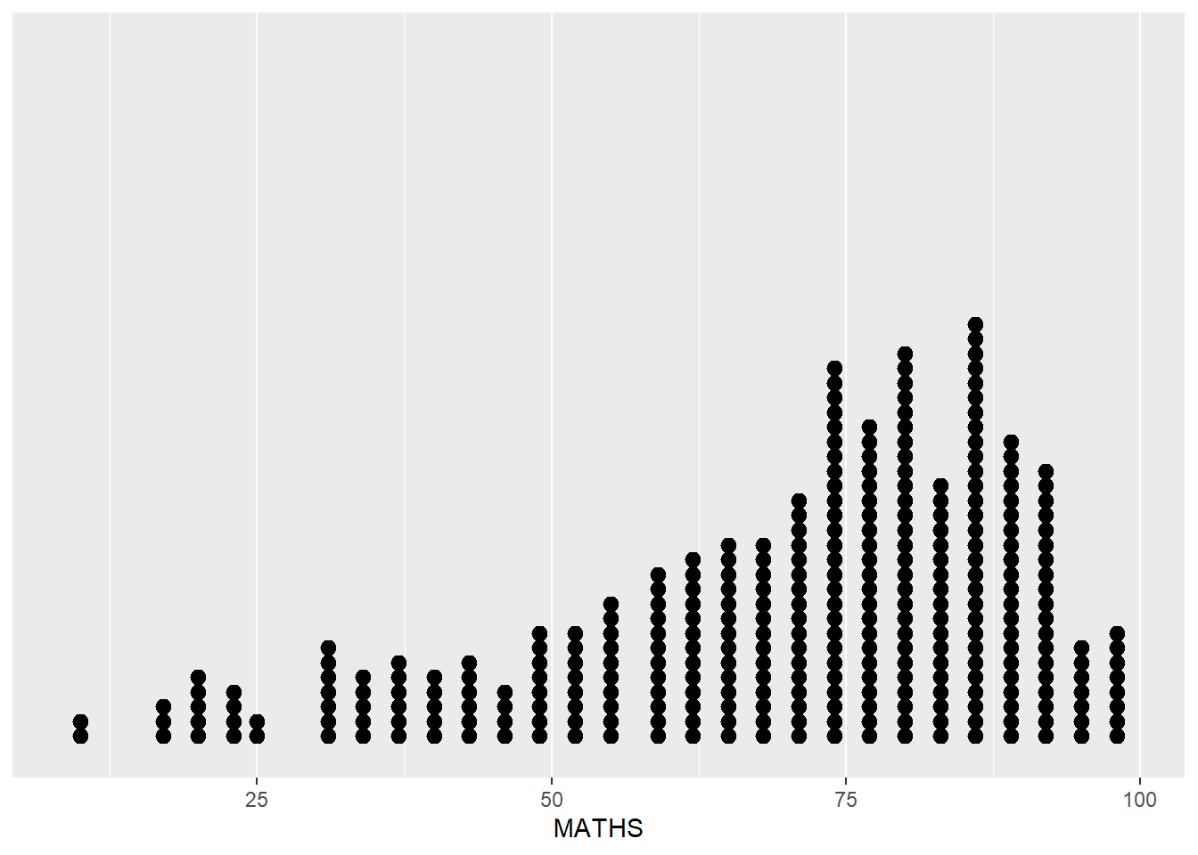
Histogram
ggplot(data=exam_data,
       aes(x = MATHS)) +
geom_histogram() 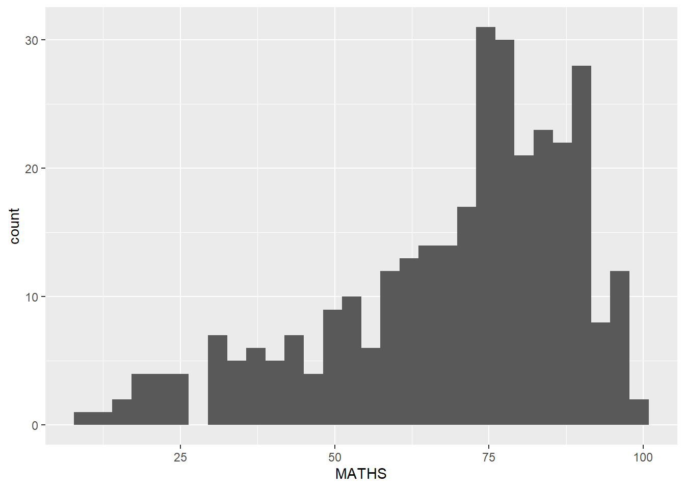
changing aes()
ggplot(data=exam_data,
       aes(x= MATHS,
           fill = GENDER)) +
  geom_histogram(bins=20,
color="grey30") 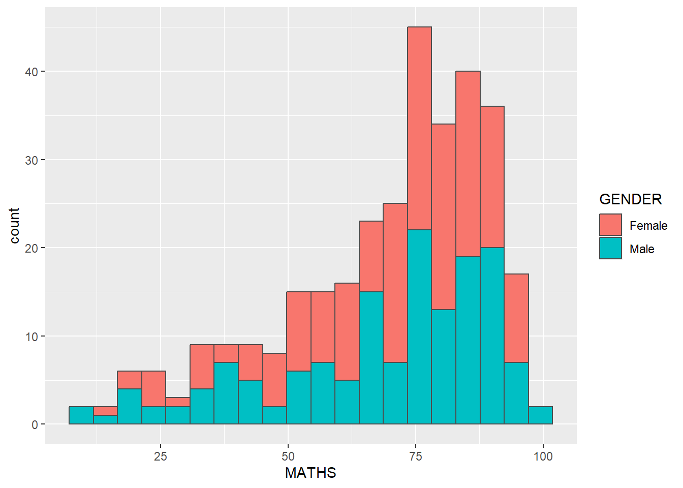
ggplot2: geom
geom-density()
ggplot(data=exam_data,
       aes(x = MATHS)) +
geom_density() 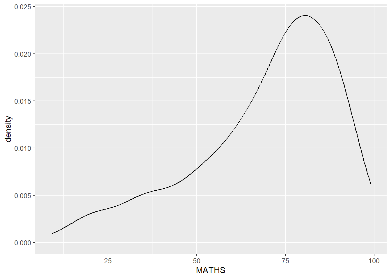
ggplot(data=exam_data,
       aes(x = MATHS,
           colour = GENDER)) +
geom_density() 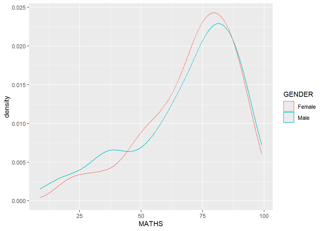
geom_boxplot
ggplot(data=exam_data,
       aes(y = MATHS,
           x= GENDER)) +
geom_boxplot() 
ggplot(data=exam_data,
       aes(y = MATHS,
           x= GENDER)) +
  geom_boxplot(notch=TRUE)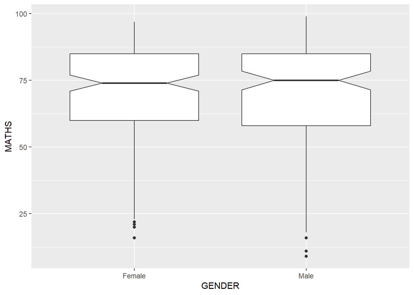
geom_violin
ggplot(data=exam_data,
       aes(y = MATHS,
           x= GENDER)) +
  geom_violin()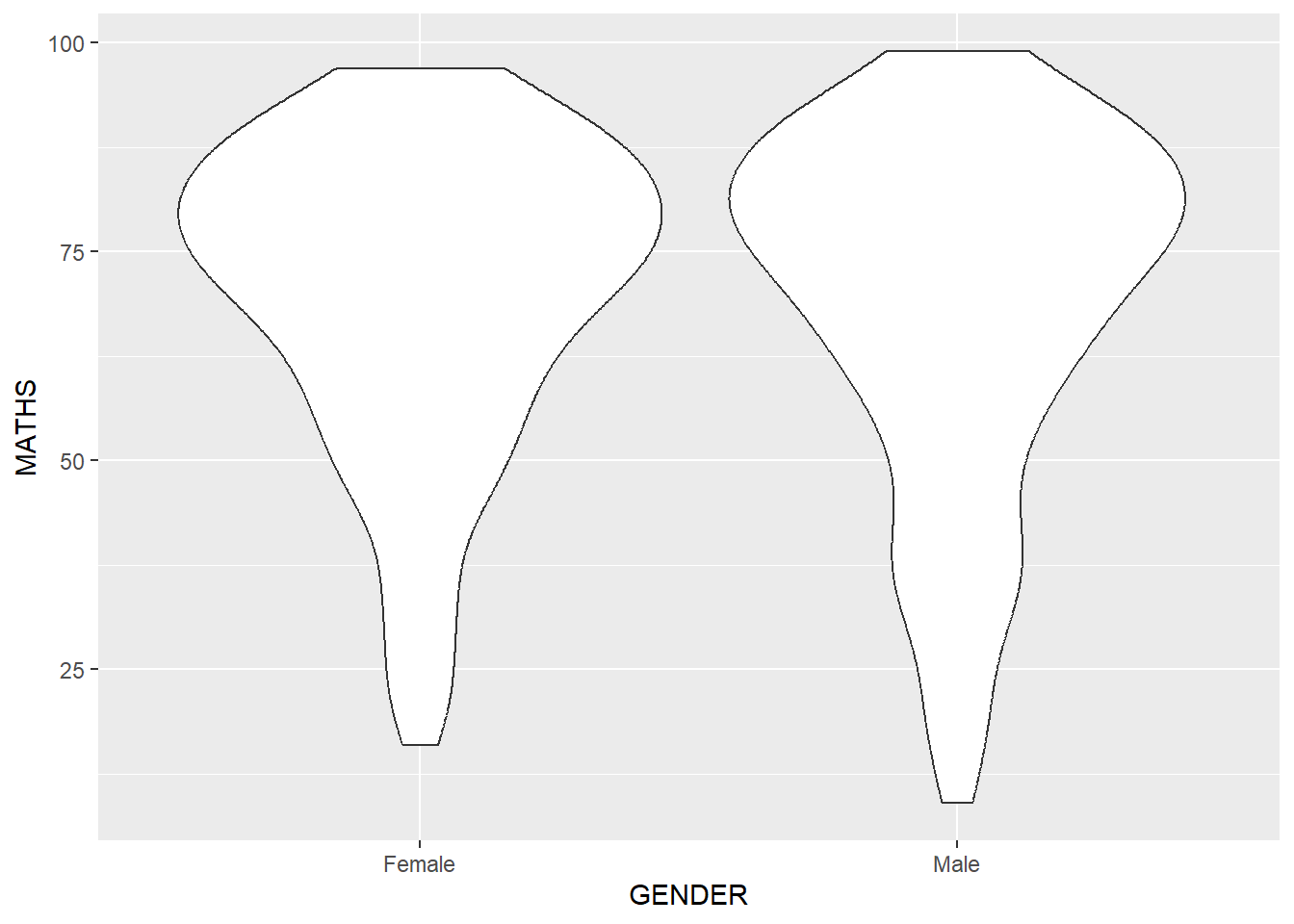
geom_point()
ggplot(data=exam_data,
       aes(x= MATHS,
           y=ENGLISH)) +
geom_point() 
combining geom objects
ggplot(data=exam_data,
       aes(y = MATHS,
           x= GENDER)) +
  geom_boxplot() +
  geom_point(position="jitter",
size = 0.5) 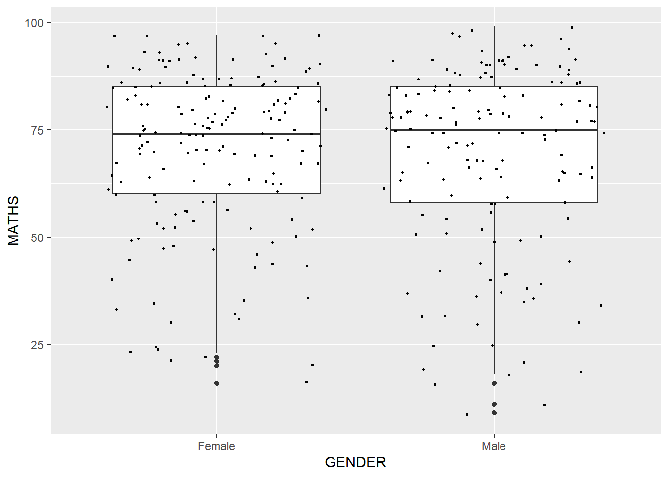
Statistics Functions
The Statistics functions statistically transform data, usually as some form of summary.
Using stat_summary() function to over ride the default geom.
ggplot(data=exam_data,
       aes(y = MATHS, x= GENDER)) +
  geom_boxplot() +
  geom_point(stat="summary",
             fun.y="mean",
             colour ="red",
size=4) 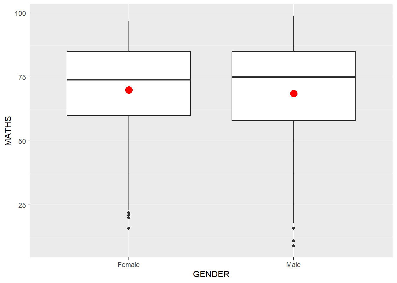
Adding best curve on a scatterplot using geom_smooth
ggplot(data=exam_data,
       aes(x= MATHS, y=ENGLISH)) +
  geom_point() +
  geom_smooth(size=0.5)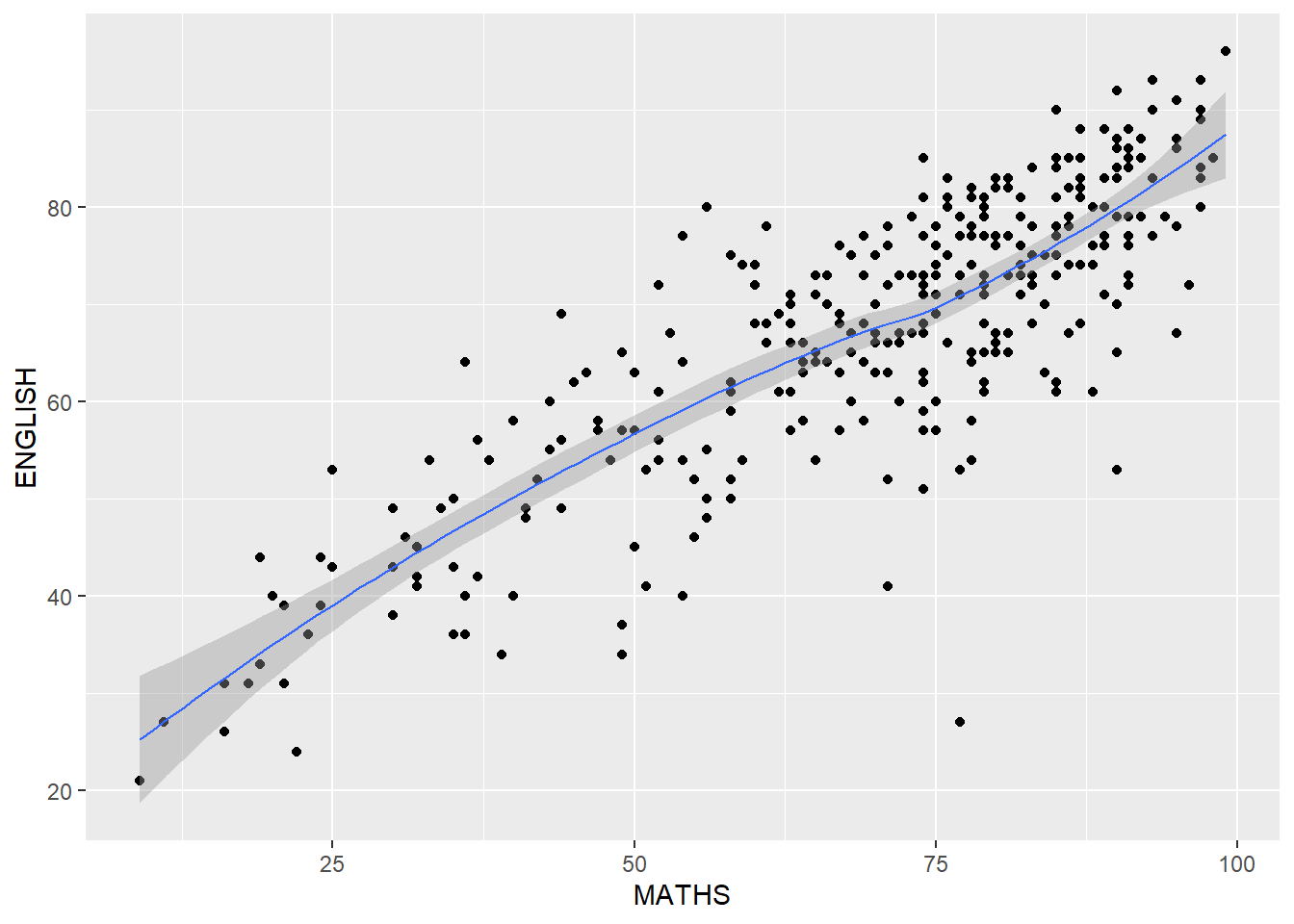
Without using geom_smooth
ggplot(data=exam_data,
       aes(x= MATHS, y=ENGLISH)) +
  geom_point()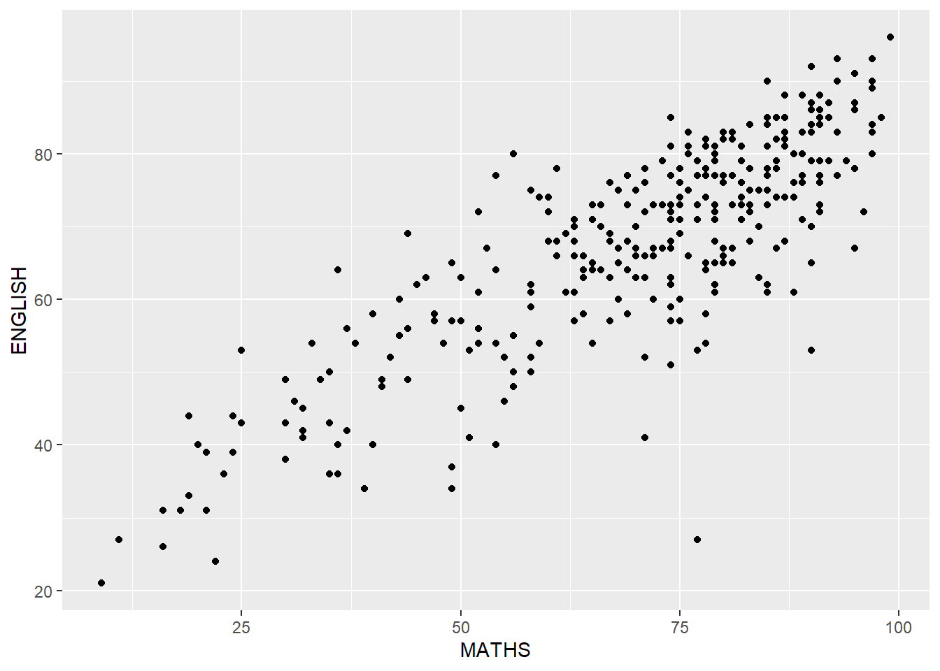
Overriding default smoothing method
ggplot(data=exam_data,
       aes(x= MATHS,
           y=ENGLISH)) +
  geom_point() +
  geom_smooth(method=lm,
              size=0.5)
ggplot2: facets
facet_wrap()
ggplot(data=exam_data,
       aes(x= MATHS)) +
  geom_histogram(bins=20) +
    facet_wrap(~ CLASS)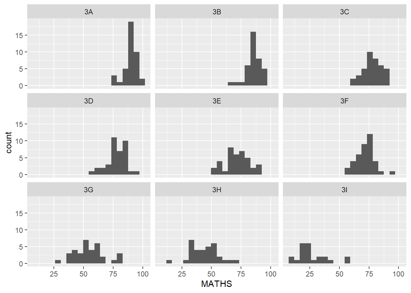
facet_grid()
ggplot(data=exam_data,
       aes(x= MATHS)) +
  geom_histogram(bins=20) +
    facet_grid(~ CLASS)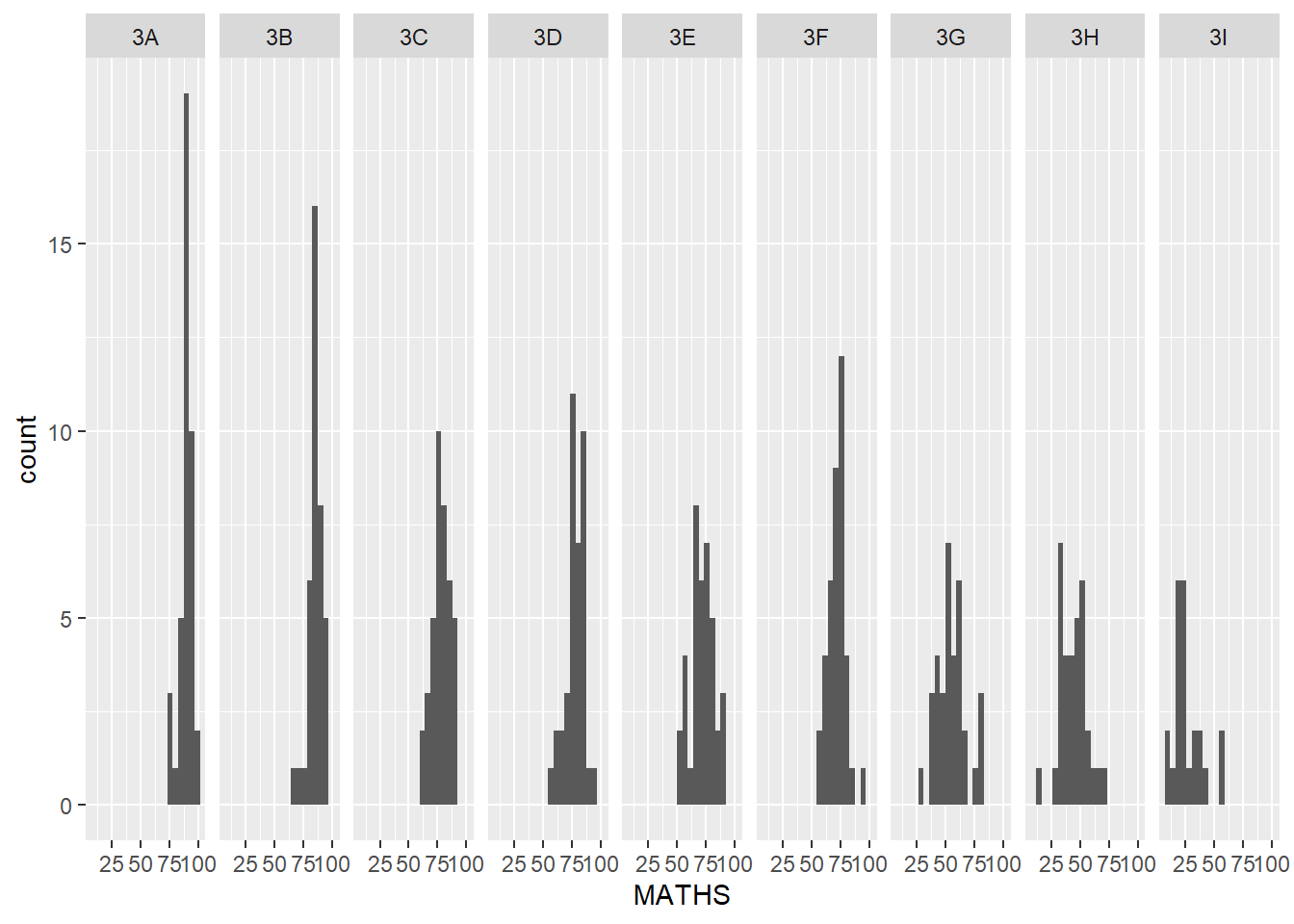
ggplot 2: coordinates
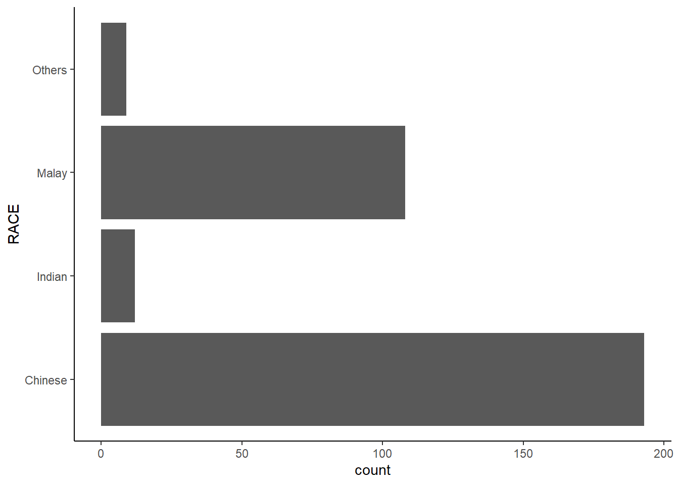
By the default, the bar chart of ggplot2 is in vertical form. The code chunk below flips the horizontal bar chart into vertical bar chart by using coord_flip().
ggplot(data=exam_data,
       aes(x=RACE)) +
  geom_bar() +
  coord_flip()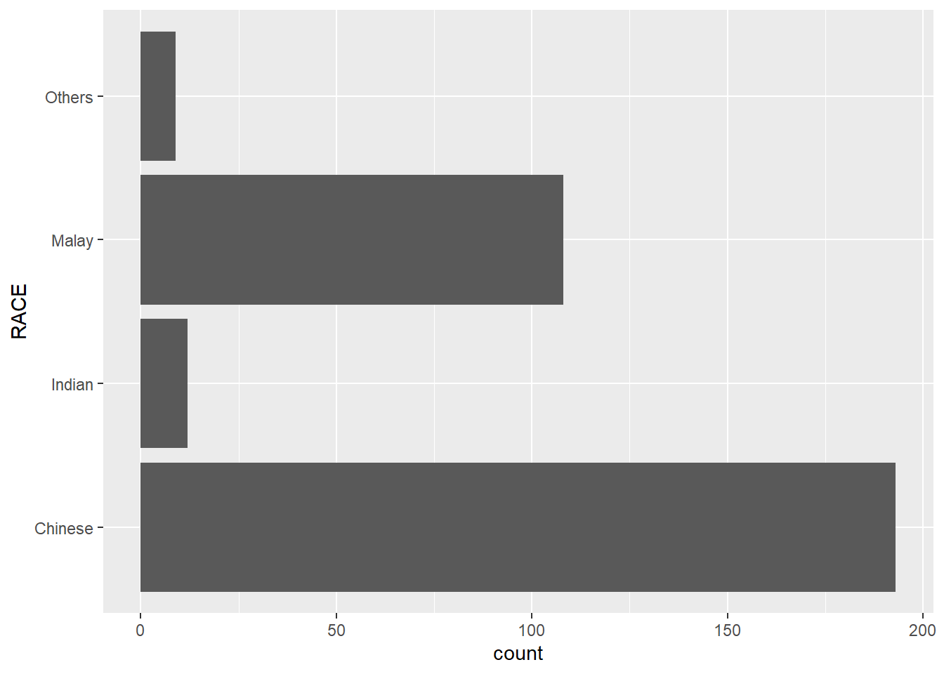
Changing the y- and x- axis range
ggplot(data=exam_data,
       aes(x= MATHS, y=ENGLISH)) +
  geom_point() +
  geom_smooth(method=lm, size=0.5)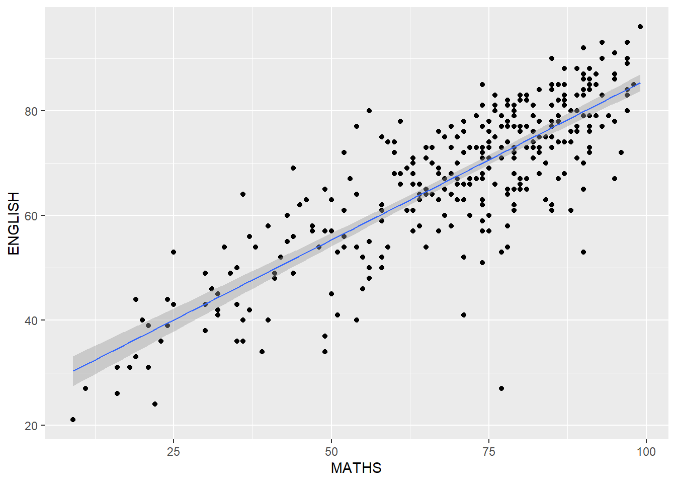
ggplot(data=exam_data,
       aes(x= MATHS, y=ENGLISH)) +
  geom_point() +
  geom_smooth(method=lm,
              size=0.5) +
  coord_cartesian(xlim=c(0,100),
                  ylim=c(0,100))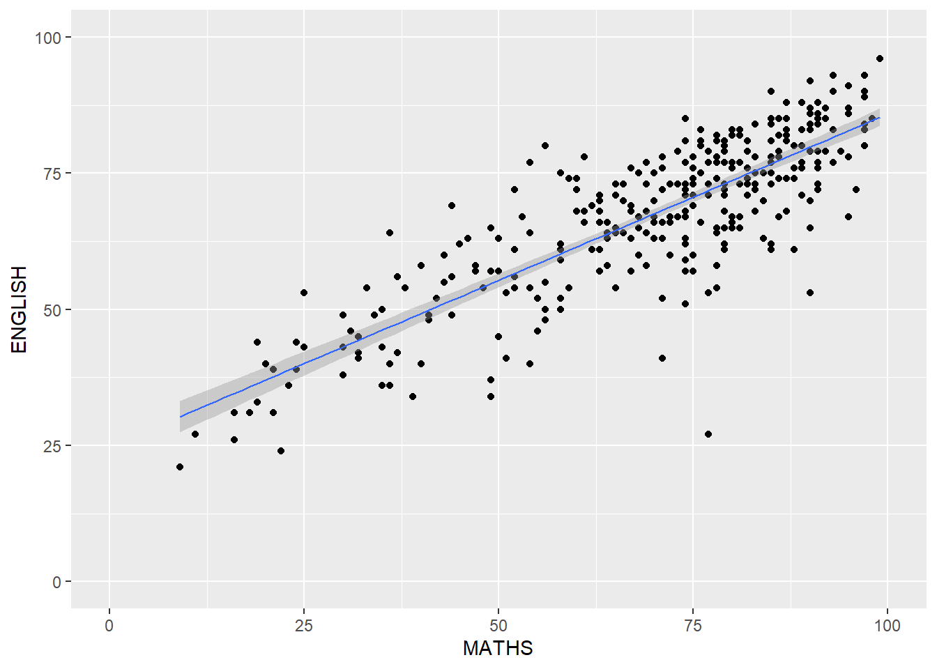
Using Themes
ggplot(data=exam_data,
       aes(x=RACE)) +
  geom_bar() +
  coord_flip() +
  theme_classic()